Pages

Monday, November 27, 2017

Genome Link Review

Genome Link - Knowledge Base
Genome Link, powered by Awakens, Inc., is a third party website that accepts raw DNA data from 23andMe and AncestryDNA to provide some health reports for free, and even more for a $89 fee (currently on sale for only $39). It does not include an ethnicity report.

The health report includes your risk of some diseases, as well as things like physical traits, personality (mental health), intelligence, nutrition, and fitness. Unfortunately, the way it presents your results is very technical and confusing. It does not explain your results in plain English so that most people can understand it easily. What's more, is that the section which is easier to understand does not even include your personal results.

Floating bubbles in Knowledge Base
There's two sections: Explore Genome (shown below), and Knowledge Base (shown above and right). The names suggest Explore Genome is where you'll find your own results, and Knowledge Base is general information, but newcomers to the field may not understand this. So at first glance, Knowledge Base looks like where you would find your health reports, but these are actually just reports on the general population's tendency towards these conditions and traits. Clicking on them will show you a chart with floating bubbles (shown right) - the bigger and more bubbles, the higher or lower a population's tendency on the scale. Different colored bubbles indicate populations from different parts of the world. Europe is blue, Asia is pink, etc. So you can see whether Asians, Africans, etc are more or less prone to certain things. It's interesting, but it really doesn't tell you anything about yourself. What's worse is that it's poorly explained and at first makes it look like these are your personal results - but as you can see in the screenshot, why would I have pink (East Asian) bubbles when I have no East Asian ancestry? These are not my results.

Exploring my genome
Where you find your personal reports is instead under "Explore Genome", but this section is highly technical and not easy to use. On the far right are your chromosomes you can click through and on the far left it lists a ton of conditions and traits in seemingly no particular order (though there is a search field above) and clicking on them will show you in the large middle space where in your genome they appear with a letter underneath indicating your genotype (shown left). This visual display is totally unnecessary, you can see all the empty space used just to tell me my genotype is "A." Most people just want to know whether they are at a higher or lower risk for a condition, but the report won't tell you this, not in plain English. All it will say is if you have a certain genotype, you should click on the link for more information. The link will take you to the publication of a medical study, which is highly technical and probably not going to be understood by most people. And you can't assume that having the certain genotype means you're at a higher risk for that condition. For example, it may sound like I am a carrier for Cystic Fibrosis because it says "If you have A then check the evidence below" - and according to them, I do have "A" (genotype). But according to every other health report I've run on my DNA, I am not a carrier for Cystic Fibrosis. So this could be very misleading. Sure enough, opening up their link to the medical publication isn't useful for a laywoman like myself, as it's full of highly technical data I can't even begin to understand.

There is a "Help" button in the lower right, but it's just a short FAQ which really doesn't tell you much more than what I've just explained.

Conclusion: While you do get a good amount of health reports for free, they are fairly useless for the average individual as they do not explain, in plain English, what they mean. And while you can also get many more reports for the $89 fee, it would still be useless unless you're an genetic academic and can understand the medical publications. If they were to add better interpretations of the results so most people could understand them, this could be a very comprehensive health report, especially given what you get for free. As for the $89 fee, you can get just as many reports (which are much easier to understand) from Promethease.com for a mere $5, so the Genome Link's fee seems extremely high, even if, as I write this, it's on sale for only $39.

Saturday, November 25, 2017

Promethease Review

A screenshot from Promethease's health report
Promethease.com is a third party website for providing a comprehensive health report from your raw DNA data. It's not free, but it is extremely affordable at only $5 per report. They accept DNA from 23andMe, AncestryDNA, FamilyTreeDNA, MyHeritage, LivingDNA, Genos, and possibly others. Promethease recommends trying to upload regardless of what company you tested with as "many formats" should work. If it doesn't work, they encourage you to email them.

There are two options when you purchase a health report: you can create a free account, or you can get your report without an account. With an account, your raw DNA data which you upload is saved on the site (until/unless you ever decide to delete it). The report generated from it is deleted from the website after 45 days, however, you can regenerate the report from your saved raw data for free at any time. If you manage more than one kit, you can include them all on one account (but each report still costs $5). If you don't create an account, after 24 hours, everything (including your raw DNA data) will be deleted from their site and if you ever need to regenerate the report, you would have to pay again. Either way, the report is downloadable to save on your computer for future use, and so you can give a copy to your doctor. So creating an account is beneficial for regenerating the report at any time for free, especially if there are updates to the report. But for those who are concerned with privacy and don't want to store their DNA on the site, they have that option. For more information on Promethease's privacy policy, see here.

Promethease's tutorial
The first thing you'll see in your health report is a tutorial that pops up when you open it. I would suggest going through it and opening the links it contains for further information. The data Promethease throws at you can be a little technical and a lot overwhelming, but the tutorial definitely helps.

Although it explains, in plain English, what different genes are associated with and what it means, whether it's good or bad for you, etc, the most confusing thing about it is that you can have one gene that says you have a decreased risk of something, and another gene that says you have an increased risk of the exact same thing. How that plays out in reality is really something you'd have to ask your doctor. Essentially, all Promethease is doing is pulling data from SNPedia, which is like Wikipedia for genetics (they source their info from peer-reviewed scientific publications), so you don't have to go looking up each one of your genes and what they might be associated with.

The amount of information the report includes makes it impossible to view everything at once, which is why they've included various ways to search, filter, and sort the results. If you want to see everything on cancer, for example, you can either use the search bar at the top for "cancer", or select cancer from the "medical conditions" drop down bar on the right. It will then list all genes you have which are associated with cancer, good or bad, or "not set" (see image above right). I normally untick the option for "not set" because this basically means there's not enough information to say whether the association is good or bad and that means it doesn't really tell you anything.

Read through all the info and click "more info" to get
complete data on what a gene is associated with.
Sometimes when you select conditions from the drop down menu, a report may not readily sound like it's associated with that condition. For example, when I select cancer, one of the reports is for "Possibly impaired folate metabolism" (shown left) and the information included doesn't mention cancer. However, reading the whole summary, tells me the gene is "linked to slightly increased risk for several types of brain cancer." This is good to know, considering my grandfather died of brain cancer. Additionally, when I click on "more info" at the bottom of the details, it takes me to this page, which includes a huge long list of others conditions it's associated with, not mentioned in the summary. So make sure you read everything thoroughly and when there is an option to click for "more info", click it. Keep in mind that a single gene may be associated with more than one condition and that may be why, at first glance, it doesn't seem associated with the condition you selected even though it is.

Magnitude chart
Also note the "Magnitude" number. This is a measure of the interest factor. SNPedia recommends magnitudes under 2 aren't worth paying much attention to. Above 3 should be particularly noteworthy. That means you may have a "bad" gene for a certain condition, but if the magnitude is low, it's probably not worth concerning yourself over. So if you have one gene that says you have a higher risk of something, and another gene that says you have a lower risk of the same thing, take a look at the magnitude for each. You may even want to filter out any reports under a magnitude of 2 or 3, as the ones above those magnitudes are the ones you're going to want to pay the most attention to.

Conclusion: Although a little technical and can be confusing if you have genes that seemingly conflict with one another, the amount of information you get for a mere $5 is absolutely worth it, particularly because they do explain, in plain English, what the results mean. This is easily the most comprehensive health report available, especially for the price. The ability to download the report in its entirety is extremely beneficial as well, not only for future reference, but also so you can give it to your doctor (an option that is surprisingly lacking on many other health reports I've used), and I would strongly recommend taking it to your doctor as well, for a better understanding.

Sunday, November 19, 2017

GenePlaza Review

GenePlaza is a third party website that allows you to upload your raw DNA data from testing companies including 23andMe and AncestryDNA, and provides you with different DNA reports, for small fees.

It offers some ethnicity reports, and some traits, and nutritional reports. To the left you can see a screenshot of all the "apps" or reports they offer and how much they each cost. The upload of your DNA is free, and they even provide you with $3 credit for uploading, which will buy you at least one app/report - so you get at least one for free. Not a bad deal, and the other apps aren't very expensive either, ranging from $1-5.

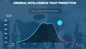
However, it doesn't provide a true health report with disease risks, only "traits" like Intelligence, Sleep, Taste. etc. The apps for Neuroticism and Weight are probably the closest to health reports and may be of use to some people, but there are other sites that will provide a much more comprehensive health report. On GenePlaza, they tell you whether you're likely to be predisposed to each condition or not, including a chart on how your results compare with other GenePlaza users.

GenePlaza's example of the Ethnicity Calculator plot chart
Of the three ethnicity options, the "Ancestry" app is likely the one most people are looking for. The K12 Ancient Admixture Calculator only reports on prehistoric populations like Hunter-Gatherer or Farmer. While it can be interesting, most people are looking for their more recent admixture report. There's two of those: "Ethnicity Calculator" and "Ancestry". The Ethnicity Calculator is simply a plot chart. It works by providing a chart showing the different populations included and how closely or distantly they relate to each other (the closer the dots on the chart, the more closely they are to one another) and then showing you where on the plot chart your DNA fits in the best. It does not provide any percentages for each population you match, which is what most people are looking for.

That brings us to the "Ancestry" app, shown below. It costs $1.89, meaning you can get it for free with the $3 credit they give you for uploading. This will provide a report much like you received with the company you tested with, percentages and all. However, the regions included are broad, for example, I got 55.7% Northwest European, 27.6% Southwest European, 15.2% Ambiguous West Eurasian, and 1.5% Ambiguous. According to GenePlaza, Ambiguous "indicates a percentage of your DNA file that did not match with any of the sources in our reference panel." So it means 1.5% of my DNA didn't match any of their samples, and 15.2% of my DNA couldn't be narrowed down further than "West Eurasian".

For me, this is fairly accurate, if not very specific. My tree is 25% Southern European (Southern Italian/Sicilian), and 75% Northern European (British, German, and Norwegian). If you add the Ambiguous results to Northwest European, that's almost exactly consistent with my tree. However, it conflicts with most other DNA ethnicity reports. 23andMe, AncestryDNA, and FamilyTreeDNA, all seem to agree I'm more like 62-64% Northern European and 36-38% Southern. Take from that what you may, keeping in mind all ethnicity reports are an estimate.

You'll note there is an option to expand my results for Northwest and Southwest European. This provides details on the more specific populations I matched from those regions, but it does not provide a percentage for these groups. For Northwest European, it says I most closely match populations from Argyll Bute (an area of Scotland), England, Norway, and Orkney Islands (off the Northern coast of Scotland). This is fairly consistent with my tree - my British roots are indeed Scottish and English, though I don't know where in Scotland so I can't confirm Argyll Bute and Orkney Islands, but the interesting this about this is I often get Orkney results in Oracle too (see here for details on what Oracle is). The only thing this break down is missing is my German roots.

My break down for Southwestern European is a little farther off the mark. They seem to think I most closely match Basque, South France, and Spain but obviously this is actually my Italian DNA.

NOTE: There has since been added a four ethnicity calculator called K25 Admixture Calculator, which means it includes 25 categories, some of which are very specific regions. I have not tested it yet for accuracy but it looks very interesting. It costs $5. Worth noting is that it has 3 categories for Native American, but none for Jewish.

GenePlaza's example of the Intelligence report (I'm probably
not that intelligent, lol)
Conclusion: Easy to use and explains everything in plain English, doesn't include much of the technical data in the background. Report options are few, but you can at least get your ethnicity break down for free and the other apps aren't expensive. Each app has an example preview showing you what you'll get if you purchase it, so you can decide whether it's worth it or not. For the free ethnicity report, it's worth checking it out, but the purchase of the other apps may not be worth the cost. Although they are inexpensive, there are other options that will provide more reports for a similar cost or even for free. See a list of upload options for your DNA here.

Friday, November 17, 2017

LiveWello Review

LiveWello report explains how I have a decreased likelihood
of gluten sensitivity and celiac disease
LiveWello is a site where you can upload your raw DNA data from several testing companies including 23andMe, AncestryDNA, and FamilyTreeDNA and get reports on a number of health related issues. It costs $19.95 to upload your raw DNA data, but they also offer an additional subscription for $5.95 monthly or $60 yearly. But what all do you get with those different options?

With the $19.95 one time upload fee, you gain access to some reports from LiveWello which explain, in plain English, whether you have an increased, normal, or decreased risk of whatever the report is about. In addition, you have access to the "Gene Library" which is a huge library of different health reports created by third parties. It's very extensive, but the drawbacks are that it doesn't explain in plain English what your risks are, and it doesn't allow you to search for a certain type of report. All you can do is scroll through the list of available reports (listed in order that they are added, with no other way to sort them) and hope to find what you're looking for. The reports only provide the raw DNA and leaves the interpretation up to you, and that means you need some understanding of DNA and how genetic variance works. Many of the Gene Library reports don't even tell you what conditions are associated with the gene(s) it's reporting on, suggesting it's only really beneficial for academics or health care professionals.

Disappointing? A bit. For $19.95, you don't get much, and then they want you to pay even more. Compared to options like Promethease, which provides hundreds of reports for only $5 (one time fee), it seems like you're paying a lot more to get a lot less with LiveWello. In addition, note that although you can upload multiple kits to one account, the fees for LiveWello (both the one time upload fee and subscription) apply to each kit you want to upload. So, let's say you manage your kit, and both your parents kits - full access to LiveWello for all of you would cost about $60 in upload fees, and about $18 monthly. That starts to really add up.

Gene Variance report from "Gene Library" template doesn't
include any explanation of what the data means (increased,
decreased, or average risk)
With the subscription, you gain access to all reports provided by LiveWello, and they also claim you gain access to "all the features included in your gene variance report" (these are for the Gene Library), but I am unclear what this includes since my gene variance reports look exactly the same before and during the subscription. So although the Gene Library is extensive, for most people, it won't be of much use unless you are knowledgeable about gene variance and how they work.

It may look like the color coding explains a tendency towards something good or bad, but it doesn't appear to be consistent and doesn't explain how having both green and red results makes you more or less prone to something.

With the one time fee, you get the following 28 reports (not including Gene Library):

1. COMT Gene and Sensitivity to Pain
2. Nexium, acid reflux disease and CYP2C19 drugs
3. Warfarin and CYP2C9 drugs
4. Plavix, blood thinners and CYP2C19 drugs
5. Response to diabetes medication - Sulfonylureas
6. Hepatitis C Treatment
7. Preference for sweet foods
8. Tramadol and CYP2D6 drugs
9. VDR Taq Gene and Osteoporosis
10. Lupus
11. Vitamin B12
12. MTHFR and Risk of Depression
13. COMT Gene and Personality Traits
14. Vitamin B6
15. Alcohol tolerance
16. Anti-depressant Response: Paxil, Celexa, Effexor or Elavil
17. Folate and the MTHFR gene
18. Caffeine and Anxiety
19. Kidney disease risk and MTHFS gene
20. Oxycodone and CYP2D6 drugs
21. Vitamin A
22. Hormone Replacement Therapy
23. Response to cholesterol lowering medication
24. Sexual Dysfunction due to Celexa, Lexapro, Prozac, Paxil or Zoloft
25. Alcohol abuse and risk of esophageal cancer
26. Zofran and CYP2D6 drugs
27. MAOA - The Warrior gene
28. Metformin

With the additional subscription, you get 93 more reports (not including Gene Library):

1. Aspirin Allergy - Asthma Risk   (Subscription only)
2. Risk of Duodenal Ulcer   (Subscription only)
3. CYP Gene and Irregular Heart Rhythm   (Subscription only)
4. Genes Related to Manic Symptoms in Bipolar Disorder   (Subscription only)
5. COMT Gene and Irritable Bowel Syndrome   (Subscription only)
6. Histamine Gene and Sensitivity to NSAIDS (Aspirin, Alleve, Advil, Motrin)   (Subscription only)
7. Floxacillin Associated Liver Toxicity   (Subscription only)
8. Narcolepsy   (Subscription only)
9. Susceptibility to Both Crohn's Disease and Ulcerative Colitis   (Subscription only)
10. FUT2 Gene and the Gut Microbiome   (Subscription only)
11. Hot flashes in post menopausal women   (Subscription only)
12. Response to bupropion treatment for smoking cessation   (Subscription only)
13. Susceptibility to food poisoning caused by Norovirus   (Subscription only)
14. COMT Gene and Antipsychotics   (Subscription only)
15. G6PD Gene and Risk of Hemolysis with Bactrim   (Subscription only)
16. Methamphetamine and Risk of Psychosis   (Subscription only)
17. Painful Menstrual Period and BDNF Gene   (Subscription only)
18. COMT Gene and Response to Effexor   (Subscription only)
19. MTHFR Gene and Pravastatin Efficacy   (Subscription only)
20. Risk of Deep Vein Thrombosis   (Subscription only)
21. Levofloxacin and Risk Of Seizures   (Subscription only)
22. Response to Treatment of Blood Pressure with Benazepril   (Subscription only)
23. Response to steroid treatment of Crohn's disease   (Subscription only)
24. COMT Gene and Tobacco Use Disorder   (Subscription only)
25. MTHFR Gene and risk of Stroke   (Subscription only)
26. Medication Overuse Headaches   (Subscription only)
27. Risk of Acute Psychosis with Cannabis   (Subscription only)
28. Processed Meat and Risk of Colorectal Cancer   (Subscription only)
29. Response to Vitamin E Supplementation   (Subscription only)
30. Fat and Obesity (FTO) Gene and Risk of Alzheimer's Disease   (Subscription only)
31. Cold Sores   (Subscription only)
32. APOE gene and Alzheimer disease risk   (Subscription only)
33. Risk of liver damage with Depakote (valproic acid)   (Subscription only)
34. Aspirin Allergy - Hives   (Subscription only)
35. Risk of Developing Multiple Sclerosis   (Subscription only)
36. Efficacy of Blood Pressure Medication, Norvasc   (Subscription only)
37. NOS Gene and Response to Viagra   (Subscription only)
38. APOE Gene, Cholesterol level and Diets   (Subscription only)
39. Vitamin D   (Subscription only)
40. Response to Carisoprodol (SOMA)   (Subscription only)
41. Heart Failure Treatment with Bidil   (Subscription only)
42. Breast Cancer Treatment   (Subscription only)
43. MTHFR, Homocysteine and Nitrous Oxide Anesthesia   (Subscription only)
44. Hormone Replacement Therapy, SULT1A Gene and Risk of Endometrial Cancer   (Subscription only)
45. Abacavir   (Subscription only)
46. Migraine response to vitamin supplementation   (Subscription only)
47. NTRK2 Gene and Lithium Efficacy   (Subscription only)
48. Smoking cessation with nicotine replacement therapy   (Subscription only)
49. GNB3 Gene and Antidepressant Toxicity   (Subscription only)
50. Response to Narcolepsy Drug - Modafinil   (Subscription only)
51. BDNF Gene and Depression - Response to Paxil   (Subscription only)
52. Tegretol Efficacy in Treatment of Seizures   (Subscription only)
53. NOS3 Gene and Response to Blood Pressure Medications   (Subscription only)
54. Phenytoin and CYP2C9 drugs   (Subscription only)
55. Heroin Addiction   (Subscription only)
56. SLC2A3 Gene and Dyslexia in Children   (Subscription only)
57. Sensitivity to Muscle Relaxants Used in General Anesthesia   (Subscription only)
58. APOE Gene and Exercise Response   (Subscription only)
59. General Anesthesia - postoperative nausea and vomiting   (Subscription only)
60. G6PD deficiency, risk of malaria and drug-induced hemolysis   (Subscription only)
61. STXBP5L Gene and Facial Aging   (Subscription only)
62. Multiple Chemical Sensitivity   (Subscription only)
63. MTHFR Gene and Smoking Behavior   (Subscription only)
64. Response to Ibuprofen (PTGS gene)   (Subscription only)
65. Fibromyalgia and Chronic Widespread Pain   (Subscription only)
66. MTHFR Gene and Migraine with Aura   (Subscription only)
67. MTHFR, Metformin and risk of blood clots   (Subscription only)
68. Tylenol and Risk Of Liver Failure   (Subscription only)
69. 5-fluorouracil   (Subscription only)
70. MTHFR Gene and Risk of Male Infertility   (Subscription only)
71. OPRM1 Gene and Opioid Antagonists   (Subscription only)
72. COMT, LRP2 Genes and Risk for Gout   (Subscription only)
73. Obesity risk   (Subscription only)
74. NSAIDS and Acute Coronary Syndrome risk   (Subscription only)
75. SSRI Antidepressants and CYP2C19 Gene   (Subscription only)
76. Susceptibility to Hypertension   (Subscription only)
77. Hypersensitivity to Mercury   (Subscription only)
78. Gluten intolerance genes   (Subscription only)
79. Choline - dietary requirement in premenopausal women   (Subscription only)
80. COMT Gene and Skeletal Muscle Decline in Older Women   (Subscription only)
81. Elite physical power and sprint performance   (Subscription only)
82. Omega-3 Fatty Acids   (Subscription only)
83. Susceptibility to Pregnancy-induced hypertension   (Subscription only)
84. Polycystic Ovary Syndrome (PCOS)   (Subscription only)
85. Naltrexone and Treatment of Alcoholism   (Subscription only)
86. Earwax and Body Odor   (Subscription only)
87. MTHFR gene and Diabetic Neuropathy   (Subscription only)
88. Risk of Cough with Blood Pressure Medication   (Subscription only)
89. Cluster Headaches and Response to Treatment   (Subscription only)
90. COMT Gene and Response to Opiods   (Subscription only)
91. Salt sensitivity   (Subscription only)
92. Risk of Severe Hypersensitivity to Tegretol   (Subscription only)
93. Genes Associated with Empathy   (Subscription only)

Not all reports are available depending on which company
you tested with
Another thing to factor in is the fact that if you uploaded your raw DNA data from AncestryDNA, FamilyTreeDNA, and possibly other companies, some of the reports may not be possible due to the necessary SNPs not being included. Not all testing companies include the same SNPs or the same amount of SNPs. FamilyTreeDNA in particular removes about 3,000 medically relevant SNPs. So you could wind up not even having access to all these reports even when you subscribe. With AncestryDNA, I noticed a number of reports were "incomplete because none of the SNPs in it were found in your raw data." And even if you have some of the SNPs necessary, if you don't have all of them, it still may not be able to generate the report and say you have "insufficient genotypes to determine response for" that report. These included but may not be limited to (and may vary depending on the company you tested with):

1. SLC2A3 Gene and Dyslexia in Children
2. Floxacillin Associated Liver Toxicity
3. Response to diabetes medication - Sulfonylureas
4. G6PD Gene and Risk of Hemolysis with Bactrim
5. Methamphetamine and Risk of Psychosis
6. Tramadol and CYP2D6 drugs
7. Response to steroid treatment of Crohn's disease
8. Oxycodone and CYP2D6 drugs
9. Abacavir
10. NTRK2 Gene and Lithium Efficacy
11. Tegretol Efficacy in Treatment of Seizures
12. NOS3 Gene and Response to Blood Pressure Medications
13. Phenytoin and CYP2C9 drugs
14. Hormone Replacement Therapy
15. G6PD deficiency, risk of malaria and drug-induced hemolysis
16. Response to Ibuprofen (PTGS gene)
17. Sexual Dysfunction due to Celexa, Lexapro, Prozac, Paxil or Zoloft
18. Zofran and CYP2D6 drugs
19. Risk of Cough with Blood Pressure Medication
20. Choline - dietary requirement in premenopausal women
21. General Anesthesia - postoperative nausea and vomiting
22. Vitamin B6
23. Risk of Deep Vein Thrombosis
24. Hot flashes in post menopausal women
25. APOE Gene, Cholesterol level and Diets
26. Nexium, acid reflux disease and CYP2C19 drugs
27. Warfarin and CYP2C9 drugs
28. Plavix, blood thinners and CYP2C19 drugs
29. Narcolepsy
30. Susceptibility to Both Crohn's Disease and Ulcerative Colitis
31. FUT2 Gene and the Gut Microbiome
32. Susceptibility to food poisoning caused by Norovirus
33. Risk of Acute Psychosis with Cannabis
34. Alcohol tolerance
35. Cold Sores
36. APOE gene and Alzheimer disease risk
37. NOS Gene and Response to Viagra
38. Vitamin D
39. Response to Carisoprodol (SOMA)
40. Hormone Replacement Therapy, SULT1A Gene and Risk of Endometrial Cancer
41. APOE Gene and Exercise Response
42. SSRI Antidepressants and CYP2C19 Gene
43. Risk of Severe Hypersensitivity to Tegretol

That's more than a third of all the reports LiveWello provides (not including Gene Library).

Conclusion: The 28 reports you get for $19.95 are probably not worth the money, and can probably be obtained from other venues for less. However, if you're going to spend the $19.95 to upload, you might as well subscribe because it's only another $5.95 and you get a good deal more for that - you can cancel after the first month and you won't be missing anything. If they wind up adding a report you need or want later, you can always renew your subscription for another month. You may want to try cheaper venues like Promethease first though, you might find it is more comprehensive for much less money. For decent free options, I would try Codegen, GeneKnot, or Impute.

See a list of more places you can upload your DNA to here.

Friday, November 10, 2017

AncestryDNA's New Arrangement of Ethnicity and Genetic Communities

An ethnicity report showing new arrangement of
Genetic Communities
You may have recently noticed your AncestryDNA Ethnicity Report and Genetic Communities look a little different and I've been seeing a lot of people who are confused about them so let me clear some things up. Ancestry posted on their blog about the changes, but didn't really address some of the confusion about it.

First, your ethnicity report hasn't changed. A couple of the category titles have change - for example, "Ireland" is now called "Ireland/Scotland/Wales" but in case you never noticed, that category always primarily included those countries. It has not changed to include more countries that it didn't before, only the title has changed to better reflect the areas it has always covered. Below you'll see a screenshot I took before the changes were made. You'll see the details for the category "Ireland" were always "Primarily located in: Ireland, Wales, Scotland" and "Also found in: France, England". If you look at the details for the newly named "Ireland/Scotland/Wales" you'll see it says the very same thing.

This is why it's so important to read all the details of each category, which they keep making harder and harder to find. Currently, you have to click on the category and at the bottom of "Overview" (you may have to scroll down and click "continue reading") there's a button that says "Read More". Make an effort to check this information for every category you have results in. If you haven't looked over it before, you may be surprised to see just how many countries or areas are included in that category, both primarily and "also found in", and just how much overlap that means it has with neighboring categories too.

"Ireland" always primarily included Scotland and Wales, too. The category
name has merely changed to better reflect these areas.

Additionally, your percentages haven't changed. You may now notice that some Genetic Communities are found as sub-groups of your ethnicity categories (see screenshot at top). Nothing about your results in either features has changed, they have just rearranged things so the layout and display is different. Some Genetic Communities are still found listed separately and these are now being called "Migrations" (see screenshot at top).

These numbers are merely how many sub-groups
(Genetic Communities) are found under that category.
Most importantly, I've seen people confusing the numbers found when clicking on "see all 150+ regions" with their results or percentages. I can't make this clear enough: these are not percentages and they have nothing to do with your personal results. They are merely the number of all sub-groups (Genetic Communities) which are available so they're the same for everyone. You will note that if you expand each category/sub-group, the numbers correlate to how many sub-groups there are, and once you can no longer expand to show more, the numbers disappear. Also note the screenshot I've provided (right) - compare it with your own and you'll see the numbers are the same. They are not a further break down of your results. When you click on "see all 150+ regions", the only indication of your personal results is that the categories and sub-groups (Genetic Communities) you have results in will have a colored dot to the left of them (and these are the very same categories and groups you've already seen on your personal results before you clicked on "all see 150+ regions" - there's nothing different here). Categories or sub-groups you have no results in will have a grey dot next to them instead. The only thing you get out of clicking on "see all 150+ regions" is seeing what other categories and Genetic Communities are available which you didn't get results in.

UPDATE Mar 20, 2018: AncestryDNA have recently updated the "See all 150+regions" section to better reflect what I explained above (shown left). Now, instead of just numbers on the right, they actually say "+13 regions" underneath the category title. Additionally, they added the words "No connection" for every group you don't have any results in, although the little grey dots versus colored dot are still there and remain another indication of whether you have results in that category (colored) or not (grey). So there definitely shouldn't be any more confusion. It's a wonder it took them this long to realize how confusing it was and make it clearer, but at least they have now.

(Also note, since I don't think I mentioned this previously, that Genetic Communities have a dotted line circling the little dot, whether colored or not, to distinguish them from the ethnicity percentages categories, which have no dotted line).

Tuesday, October 17, 2017

An Oracle Analysis

I'm going to illustrate how I interpret my Oracle results, because I still see a lot of people asking "what do my Oracle results mean?" If you haven't already, you may want to read my intro guide to Gedmatch's Admixture and Oracle, but I'd like to elaborate on that a little bit.

Firstly, it's important to remember that the results can be very speculative and it's best not to take them very literally. People in neighboring regions simply share too much DNA to always be able to tell them apart with accuracy. That means the more narrowed down the areas are in the result, the more speculative it is. You could be German, for example, and get French results because they are neighboring countries who share a lot of DNA. It doesn't mean you're French, it just means this particular calculator put that French/German shared DNA into French instead of German.

Eurogenes K13 Oracle 4, using 4 populations approximation
Secondly, your results are going to be different for each calculator you use so don't just stick to one, explore all those which apply to your background (ie, don't go using Ethiohelix when you're 100% European). Certain calculators may give you more or less accuracy than others. In my personal experience, Eurogenes K13 Oracle 4 (right) isn't very accurate. It really wants me to be Jewish and I'm really not - I have no known Jewish ancestry and don't get any Jewish results from any of the big 4 companies, or in any of Gedmatch's Admixtures. It crops up in the odd Oracle result, but none so much as Eurogenes K13 Oracle 4 populations. I personally have found K15 and EUtest Oracle's to be more accurate, and since K15 is a more recent version of EUtest, that's what I'm going to use to demonstrate how to read Oracle results in some more depth than before.

I find the best thing to do is rather than look at your Oracle results and try to pick one combination that fits you best, or shows the closest distance, look at the results on the whole. Which populations are you seeing the most? Which ones the least? Although I like to look at 4 populations the most because I am primarily from 4 different regions in Europe, you can also look at the 1, 2, and 3 populations modes.

These are my Eurogenes EUtest V2 K15 Oracle 4 results:

1 Orcadian + South_Italian + West_German + West_German @ 4.425306
2 French + South_Italian + West_German + West_Norwegian @ 4.689746
3 South_Italian + Southwest_English + West_German + West_German @ 4.689806
4 East_Sicilian + Orcadian + West_German + West_German @ 4.747531
5 Italian_Jewish + Orcadian + West_German + West_German @ 4.835878
6 East_Sicilian + Southwest_English + West_German + West_German @ 4.850750
7 Italian_Abruzzo + West_German + West_German + West_German @ 4.853912
8 North_Dutch + South_Italian + West_German + West_German @ 4.863277
9 French + Orcadian + South_Italian + West_German @ 4.911067
10 South_Italian + Southeast_English + West_German + West_German @ 4.914701
11 Tuscan + West_German + West_German + West_German @ 4.922722
12 Central_Greek + Orcadian + West_German + West_German @ 4.922800
13 South_Italian + West_German + West_German + West_Norwegian @ 4.927629
14 Irish + South_Italian + West_German + West_German @ 4.941526
15 South_Italian + West_German + West_German + West_Scottish @ 4.958009
16 East_Sicilian + French + West_German + West_Norwegian @ 4.978409
17 East_Sicilian + French + Orcadian + West_German @ 4.982550
18 South_Italian + West_German + West_German + West_German @ 5.005996
19 South_Italian + Spanish_Galicia + West_Norwegian + West_Norwegian @ 5.010231
20 Central_Greek + Southwest_English + West_German + West_German @ 5.011045

So rather than saying the top results must be the most accurate because it's the closest distance, and determining it to be only somewhat accurate because it did identify my German, Italian, and Scottish ancestry, but not my English or Norwegian, let's look at the entire results as a whole.

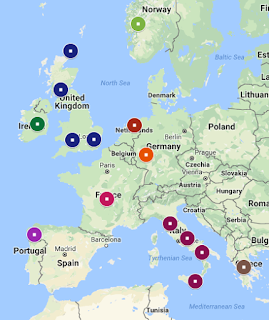
Map showing my known ancestor's birth
places in Europe
What am I seeing the most? Probably West German. This is very accurate, I have a lot of West German ancestry on both sides of my tree, and I estimate it makes up about 25% of my tree. I also have a couple Swiss-German branches, which is still fairly consistent with West German. There's one ancestor who was from Bavaria, which is a region of Germany more to the east, but I have no idea what part of Bavaria - could have been the western most part for all I know. What I do know is that I rarely ever get admixture/ethnicity results in Eastern Europe and when I do, it's normally in such small portions, it's likely noise. So this is all very consistent with my tree.

I'm also seeing South Italian and some other Italian regions like East Sicilian and Abruzzo. This is incredibly accurate. I do indeed have Sicilian, Abruzzo, and other Southern Italian ancestry. My paternal grandmother was of entirely Italian descent so that makes up another 25% of my tree. My Sicilian branch is a bit more Northern Sicily than Eastern, but that's fairly negligible. There's one count of Tuscan and as far as I know I have no Tuscan ancestry, but that too is probably not very significant since it only shows up once.

There's a few West Norwegians thrown in there, which is also accurate, I have one great grandparent who was Norwegian, making up 12.5% of my tree. Several branches were indeed from Western Norway, although one branch did come from the more Eastern towns of Bamble and Skien.

Map showing my population results for
Eurogenes K15 Oracle 4, compare with above map
You may also notice a few Orcadian and West Scottish populations. This is somewhat accurate, I do have several Scottish or Scots-Irish branches dating back to colonial times, but where exactly in Scotland they were from isn't really known. Orcadian (people from the Orkney Islands) seems a little unlikely as my understanding is most Orcadian immigrants went to Canada through the Hudson Bay Company rather than the US. But if we consider Orcadian as a representation of my Scottish or even British heritage, it makes sense. The Orcadians were also influenced by the Vikings, so there's also a potential connection to my Norwegian side. My overall British branches make up about 34% of my tree, and in addition to Scottish, includes English, so it's not surprising to find a few instances of Southeast or Southwest English. As you can see from the map above, I do indeed have ancestry in Southwest and Southeast England, although I have more recent roots in Northern England, near Manchester so it's a shame it didn't pick this up. It's possible Oracle is underestimating my British ancestry, since there's only a few English populations included, but when you consider how genetically similar the British and Germans are, and knowing how many instances of West German are listed, it makes some sense.

I lastly have a smidgen of colonial Dutch and French Huguenot in my tree but I don't know how realistic it is to expect that to show up in admixture results, as it may have been from too long ago. They make up about 1-2% each of my tree. So when I see a few results for North Dutch and French, I'm taking it with a grain of salt. I'd like to think it could be from colonial ancestry but the way Oracle works by identifying the populations you match most closely, it doesn't seem likely I would closely match a population from so far back in my tree. It seems more likely that it's just being picked up from neighboring regions where I have ancestry.

Likewise, I wouldn't put much thought into the remaining few instances of Italian Jewish, Central Greek, Irish, and Spanish Galicia. Irish is probably just representing my British background, as those two groups are closely related, and likewise, Italian Jewish, Central Greek, and Spanish Galicia may be related to my Italian heritage since they're all from that Mediterranean area. In any case, since there's only one or two counts of them, it's easy to ignore them.

So overall, despite the fact that it doesn't always identify my British/English ancestry as much as it maybe should, it's actually remarkably accurate when you look at it on the whole. Compare the two maps above, one showing the origins of my ancestors and the other showing my Oracle results, and they really aren't far off each other (keeping mind some of the locations for the Oracle map cover a larger area than what the pinpoints represent). Mapping it out is another good, fun way to analyze your admixture or Oracle results, if you'd like to try it, just go to My Google Maps.

I don't normally worry too much about the distance unless it starts getting really high. For example, K13's Oracle has closer distances than K15, but the populations in K15 are far more accurate for me than K13. I am NOT saying K15 is the best option for everyone. When I look at my dad's K15 Oracle results, they are mostly inaccurate, constantly insisting he is Lebanese Druze, which seems very off base. I can't even promise that there will be an Oracle calculator that is as accurate for you as Eurogenes K15 is for me, since I haven't really found one for my dad that is this accurate (he does get a lot of Abruzzo results in various calculators, which is accurate, but there's also a lot of populations that are kind of out there for him).

Also keep in mind some of the calculators contain a lot of ancient (prehistoric) populations. If you see some weird names like "Battle Axe" or "Bell Beaker", these are probably ancient populations (Battle Axe is Neolithic, Bell Beaker is western Europe in late Neolithic-early Bronze Age).

I hope this gives some more detailed insight in how you might interpret your own Oracle results. If you are adopted and don't know your ancestral background, it's difficult to know which calculators will be more accurate than others. You should definitely still take all this with a grain of salt, but it is fun to examine and compare with what we do know.

Wednesday, October 4, 2017

The Forgotten Witch Trials of Connecticut, 1647-1697

Dramatized depiction of a witch trial
I recently discovered that I had an ancestor involved in the witch trials of Connecticut and of course immediately went to look up more information on this subject. I was very surprised to find that while there are a lot of articles about it around the internet, none came from the popular Wikipedia. (Edit: this has finally now changed - see here). There are only a few books which detail the Connecticut events and fewer still which are dedicated entirely to them. Even history buffs often admit to not knowing about the Connecticut witch trials, in spite of the fact that the very first ones in the colonies occurred in Connecticut. It's safe to say they are greatly eclipsed by the Salem witch trials, which perhaps receive more attention because they occurred over a much shorter time period. Salem was very much a frenzied hysteria with the executions of 20 people within just over a year (February 1692 to May 1693), whereas the trials in Connecticut resulted in 35 cases and just 11 executions over the course of 50 years (1647-1697). Salem certainly deserves the attention it gets, but it should not be at the cost of forgetting other important witch hunts too.

Oddly, the ancestor in question, Christopher Comstock, has his own Wikipedia page, despite the greater trials in which he was involved not having one. Christopher was involved in the witch trials twice, firstly in 1653-1654 when he gave an affidavit about having visited Goodwife Knapp while she was in prison for witchcraft. Knapp was later executed. Secondly, he served on the grand jury investigating witchcraft in Connecticut in September 1692.

One of the reasons these trials kept cropping up was because every time someone was accused of witchcraft, they were pressured to "confess" and name others they knew of who were also witches. According to the author of "The witchcraft delusion in colonial Connecticut," from the moment Knapp was sentenced she "was made the object of rudest treatment, espionage, and of inhuman attempts to wring from her lips a confession of her own guilt or an accusation against some other person as a witch." Just as we might question a terrorist to confess who they are working with, this logic was applied to "witches" too in the 17th century. This is where my ancestor Christopher Comstock comes in. In 1653, Goodwife Knapp, whose first name is lost to history, was in prison in Fairfield for witchcraft. Comstock, along with Thomas Sheruington and Goodwife Baldwin, visited her in her cell where Baldwin questioned her about her fellow "witches". It sounds as though Comstock and Sheruington were merely there as witnesses. Knapp admitted that she knew some, or at least one person who had "received Indian gods that were very bright." Knapp was claiming her innocence so Baldwin asked her how she could know this if she weren't a witch herself, to which Knapp responded that the guilty party had told her so. It appears that Knapp did not reveal the name of the person who told her this though. During another questioning by Mistress Pell, Knapp insisted, "I have sins enough already, and I will not add this [accusing another] to my condemnation."

The court didn't believe her plea of not-guilty, because Knapp was convicted and executed by hanging. She went to the grave pleading her innocence. My ancestor's role in this was minor, he was merely witness to an interview with Knapp as prisoner. His affidavit was not even used at her trial, since it was actually written after the fact, to be used in another case the following year. Unfortunately, there are few details about Knapp's trial, we do not even know the specifics of what she was accused of, who accused her, what the testimonies against her included, etc. Most of what we know about Knapp comes from an investigation after her 1653 execution in which testimonies were given about Knapp's supposed accusations of another, Mary Staples, which is when Comstock wrote his affidavit.

After Knapp's execution, her body was desecrated when several individuals stripped it and searched it for marks of a witch. Mary Staples proclaimed there were no marks on Knapp's body that couldn't also be found on herself, an attempt to claim there were no witch's marks on Knapp's body. Later, Robert Ludlow claimed that just before her execution, Knapp had requested to speak to him privately, during which she told him that Mary Staples was a witch. This seems unlikely given the fact that she wouldn't name anyone under extreme pressure and duress in her cell. Why would she suddenly, on her own accord, decide to accuse Mary Staples, and furthermore, why would she do so privately, with no witnesses, if she wanted it known? It's believed Ludlow took Mary's comments not to mean Knapp had no witch's marks, but that both Knapp and Mary had them and that made Mary a witch too. But the conflict between Ludlow and Staples had been going on since at least 1651 when Ludlow won a law suit against Mary for slander, so Ludlow was likely looking for anyway he could to accuse her of anything else. Mary's husband, Thomas Staples, caught wind of Ludlow's tale, and in attempts to forestall the accusations against his wife, brought suit against Ludlow in 1654 for defamation of character, and there began the investigation in 1654, including Comstock's affidavit. There was also a witness account given by another of my ancestors, Rose Sherwood, then the wife of Thomas Barlow. Rose testified that after Knapp's execution, she was among those women who searched Knapp's body for marks. She claims at first they found nothing unusual, but then upon another look, they did.

Despite several testimonies against Mary Staples, in the end, the court saw reason and ruled in favor of her husband, awarding Ludlow with damages for defamation of character. It did not prevent a later trial against Mary for witchcraft though, in 1692, but Ludlow had left Connecticut by then and Mary was fortunately acquitted.

It is relieving to see that Comstock's affidavit did not contribute to any conviction or execution. He was merely an observer, witness of something Knapp had said, which was later used by others as an attempt to accuse someone else, but it failed. It's hard to say what he thought or felt about it. Comstock is believed to have been born about 1635, which would have made him only 18 at the time he witnessed the questioning of Knapp in 1653. If that's the case, he was quite young and his experiences in these trials must have helped shaped his development into an adult.

What else is known of Knapp is very little. In John Taylor's "The witchcraft delusion", all it says of Knapp herself is that she was "presumably a woman of good repute, and not a common scold, an outcast, or a harridan" and quotes other sources saying "she impresses one as the best woman" and that she was a "just and high minded old lady."

John Winthrop Jr.
Fast forward to 1692. Salem is in its height of witch trial hysteria and Connecticut isn't far behind, with the trials of six women in Fairfield, all accused by the same servant girl, Katherine Branch. Fortunately, unlike in Salem, none were executed. After Hartford saw the trials of nine people and the executions of four of them in 1662, the Connecticut governor John Winthrop Jr made it necessary for two witnesses for each alleged act of witchcraft to be required for a conviction, rather than only one. This made convictions much more difficult and resulted in no further executions of witches in Connecticut after 1662. Winthrop appears to have been the saving grace of Connecticut, and something of an antithesis to Salem's Cotton Mather, often personally overturning or reversing convictions. He may have been the main reason Connecticut had fewer executions of witches overall than Salem, and none at all during Salem's mass of them in 1692. However, that's not to say the Fairfield trials in 1692 didn't results in any convictions at all. Of the six women accused, three were acquitted, two never went to trial (jury found no bill, meaning there wasn't enough evidence to go to trial), and one, Mercy Disborough, was convicted. She was never executed though, as she was later pardoned. Christopher Comstock was on the jury that convicted Mercy, but also acquitted and found no bill for the other five women. So my ancestor was (partially) responsible for the conviction of Mercy Disborough on the charge of witchcraft, but fortunately not for her death.

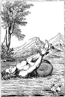
An engraving of one floating on water
during ordeal by water (ie, guilty)
Although Katherine Branch made the initial accusation, there were numerous testimonies against Mercy, so it seems she ruffled more than enough feathers, though nothing that should warrant her execution. Most of the accusations were ridiculous to think they could be related to Mercy, including one unnamed young woman prone to seizures who accused Mercy of being responsible for them. Mercy was subjected to being searched naked for marks of the devil, and even to the water test, or ordeal by water. This is the notorious test where one's hands and feet are bound together before being thrown into the water and if they sink, they are considered innocent, and if they float, they are considered guilty. The basis of this was the ridiculous theory that witches floated because they had renounced baptism and therefore were being rejected by the water. Another idea was that witches were supernaturally light weight. In any case, naturally, they were pulled out of the water before they drown, by a rope which was tied to them. The idea that this sort of test meant the individual on trial would die whether found innocent or guilty (drown if innocent, executed if guilty) is a modern misconception. Mercy, along with another accused (Elizabeth Clawson), were tied up and thrown into the water on September 15, 1692, where two witnesses (Abram Adams and Jonathan Squire) claimed they floated like corks, and even when pressed down into the water, they bounced back up. However, this test obviously wasn't the deciding factor in the trials, since although Mercy was convicted, Elizabeth was not, despite both of them floating. That suggests enough people at the time were skeptical of the authenticity of such a test that its results weren't taken into great consideration.

Apart from Mercy Disborough and Elizabeth Clawson, the others who were on trial in Fairfield in 1692, accused by Katherine Branch (a servant of Daniel Wescot/Westcott), included: Mary Harvey, Hannah Harvey, Goody Miller, and Mary Staples, the same Mary Staples whose husband sued Robert Ludlow for defamation of her character and won. Most of the other Connecticut cases took place in other towns, including Windsor, Hartford, Wethersfield, New Haven, East Hampton, Saybrook, Stratford, and Wallingford, though some of them were tried in Hartford instead.

Although the Connecticut cases were spread out over time and saw fewer executions than Salem, they still played an important role in the history of witch trials and should not be forgotten.

Sources:

Also check out:
  • Connecticut Witch Trials: The First Panic in the New World by Cynthia Wolfe Boynton  
  • Before Salem: Witch Hunting in the Connecticut River Valley, 1647–1663 by Richard S. III Ross
  • Escaping Salem: The Other Witch Hunt of 1692 (New Narratives in American History) by Richard Godbeer 
  • Witchcraft Trials of Connecticut by Richard G. Tomlinson

Friday, September 29, 2017

MyHeritageDNA Matching Issues

I'm amazed, just not a good way
I'm going to illustrate why your DNA match list at MyHeritageDNA shouldn't be trusted. This has been touched on in a few other blogs (see here and here), but I want to highlight and update some details which are really very concerning.

The main problem is that the system is clearly including a high percentage of either false positive matches, or false negatives - and more than that, they are not necessarily weak matches with only small segments shared. Granted, false positives are a part of DNA matching no matter what company you test with, the nature of DNA means there are always going to be matches known as "Identical by State/Type" (IBS or IBT) versus "Identical by Descent" (IBD). Not to be confused with the medical bowel conditions using the same abbreviations, IBS matches are ones which share small amounts of DNA with you by chance, making them false positives, versus Identical by Descent which means your shared DNA comes from a common ancestor. IBS matches are a part of DNA matching no matter what - however, they only share small segments of DNA with you. This is why most companies have a cut off point where any match sharing no segments above about 7, 6, or 5 cM is automatically excluded, in attempts to reduce the amount of IBS/false positive matches included. The smaller amount of DNA you share, the more likely it is an IBS match. According to ISOGG, "False positive matching rates of between 12% and 23% have been reported for Family Finder data, and up to 34% at Ancestry using their current algorithm." So this is a normal part of DNA matching.

My closest match on MyHeritage is not a match to either my
mother or father
The trouble is, not only is MyHeritageDNA's rates of false positives much higher (around 60% according to my results and others), but more alarmingly, they are not all matches who share only small segments at the bottom of your list like normal IBS matches do. Once you get into the more distant cousins in your match list, you know that some of them are going to be IBS. However, when your top, closest match (after immediate family) who shares 89.5 cM with you (a significant amount), doesn't match either your mom or dad, you know something is very wrong. They are not just expected IBS matches, there is clearly a problem with the DNA matching system.

In fact, MyHeritage's cut off point for minimum segment size to qualify as a match appears to be 12 cM (none of my matches had a longest segment below this), which should almost assure that all the matches are IBD, not IBS (the normal cut off points are typically 5-7 cM)... and yet about 63% of my matches are clearly false positives. One of the blogs I linked to above seems to suggest these false positives are the result of imputed data (explained on their blog). While I don't fully understand imputed data, the blog is written by a professional scientist and therefore a reliable source.

Of course, it's also possible instead of being false positives for me, some of them are legit matches to me and false negatives for my parents, but here again, to have such a high match to me not turning up for either of my parents, something is clearly still wrong. If that's the case, it makes you wonder how many strong, legit matches are missing from my own match list too. Supporting the false negatives theory is the fact that none of my matches are shared matches with my Dad (don't worry, he and I match as father/child at all venues so there's no question he is my father). One could argue that's just because anyone on my dad's side who has tested is too distant to also match me, but that would have to mean I also wouldn't have any shared matches with my paternal grandfather, and yet I do. DNA doesn't skip a generation - how can I have shared matches with my paternal grandfather, but not my father, unless they are false negatives for my dad?

Of lesser concern is MyHeritage's relationship estimate ranges, which are often as specific as "1st cousin twice removed - 4th cousin", for example. No other company attempts to be as specific as this because there is so much overlap in how much DNA may be shared for different relationship types and degree. Looking at the chart to the right, you'll see that a 1st cousin twice removed is lumped into the same group, and therefore the same range of possible shared DNA, as a 2nd cousin. So why isn't the estimated range 2nd-4th cousins instead? Granted, relationship estimates take other things into consideration - not only the total amount of DNA shared, but over how many segments, and how long those segments are. Even so, if no other company is able to be as specific as 1st cousins twice removed instead of 2nd cousins, how have MyHeritage managed it? It also makes it difficult for people to understand their possible relationship with a match, since a lot of people don't even understand what "removed" means to begin with, and even those that do may have trouble knowing what relationships would be within a range that included a "removed". However, since the relationship range is only an estimate anyway, it's not a huge concern, just more of an annoyance.

I should note that all my tests (mine, my mom's, dad's, and paternal grandfather's) were transfers, meaning I had tested with another company and then uploaded my raw DNA data to MyHeritageDNA. I did not buy a test with MyHeritageDNA, and I've seen other blogs saying this makes a difference. However, since the matching database and algorithms are all the same regardless of whether you uploaded or bought a test, I don't see how this could be the case. If there's a false match in my list, then I am a false match in their list, regardless of whether one, both, or neither of us tested directly with MyHeritageDNA.

When you combine this very serious matching problem with the fact that their ethnicity report is also seemingly inferior for most people compared to other companies, it really makes their DNA test pretty worthless.Your mileage may vary regarding the ethnicity report, and of course DNA ethnicity reports are only estimates anyway, but in my experience, and that of many others, it is the least accurate out of all 4 of the big DNA genealogy companies. I highly recommend you don't get sucked in by their long running and continually reduced sales, but instead test with a more reliable company (even if it costs more) and then you can upload your raw DNA data to MyHeritage for free. Because that's about what their results are worth.

UPDATE (01/11/2018): Today I checked my kits' DNA matches at MyHeritage and so far, it looks like much of these issues have finally been resolved. The match in question who shared a significant amount of DNA with me but wasn't a match to either of my parents is now showing as a match to my dad and my paternal grandfather. In fact, my dad's kit now has a lot more matches than he had before (he previously only had 19 matches), many of them matches to me too, resolving the problem that we had no matches in common at first (except each other). Several of his original matches and now missing, suggesting they may have been false positives. And several of those still present have seen updates to how much DNA they share. So there's been a lot of changes, and it looks like they are good ones - matches now seem to make a lot more sense. Now I'm just looking forward to seeing updates in their ethnicity report.

Tuesday, September 19, 2017

A Gedmatch Admixture Guide: Parts 3 and 4

Continuing on from Parts 1 and 2 where I covered the different projects and calculators available for Admixture Proportions and what Oracle is and how to read it, I've had some requests to cover the other viewing options available like Admixture Proportions by Chromosome and Chromosome Painting. So that's what I'll be covering in Parts 3 and 4. For Part 5 on Spreadsheets, click here.

Part 3 - Admixture Proportions by Chromosome

How to find it: From your Gedmatch home page, under "Analyze your data" and then "DNA raw data", choose the option for Admixture (Heritage)" like you did in Part 1, but this time you're going to select " Admixture Proportions by Chromosome" from the bullet list. Be sure to select a project and then calculator and put in your kit number like normal. I would go with whatever calculator you found reflected your known ancestry best. If you haven't read Part 1 yet, you should do so first.

Admixture Proportions by Chromosome shows you your admixture proportions as broken down by individual chromosome; or, in other words, what percentages of each chromosome are most commonly found in which populations/ethnicity. This gives you a much more detailed view of where your DNA is most commonly found.

Admixture proportions (or ethnicity percentages) broken
down by chromosome
So with Eurogenes K13, it shows my chromosome 1 is 28.1% North Atlantic, 15.7% Baltic, 27.7% West Mediterranean, 16.9% West Asian, 10.9% East Mediterranean, and 1.1% Amerindian. This option can often show results in populations that don't show up in a normal Admixture Proportions calculator. However, always keep in mind small percentages may just be from "noise" - like a false positive. I have no Native American ancestry so the 1.1% Amerindian probably doesn't mean anything. You'll also note how I get some North Atlantic results, in varying amounts, on every single one of my chromosomes.

My Eurogenes K13 results
In my normal K13 results, I got 39.03% in North Atlantic, so this is just breaking that average of 39.03% down by chromosome. If you add up all the percentages for one population and divide it by 22 (number of chromosomes) you'll get your overall average for that population. You may note it's a little off from what the admixture calculator originally gave you - for example my average for North Atlantic when each chromosome is added up and divided by 22 is 38.89%, not the original 39.03%. I am not sure why that is, but it's such a small difference I'm not going to worry about it too much. If someone has more information on this discrepancy, please comment below!

At the bottom it says "Number of SNPs eval" - this is just how many of your SNPs were used for the evaluation.

It doesn't show which particular segments each percentage is found on though, but that brings us to the next options.

Part 4 - Chromosome Painting and Reduced Size

How to find it: Same as above, but select "Chromosome Painting" or "Chromosome Painting - Reduced Size" from the bullet list instead.


Chromosome Painting is a visual representation of your admixture proportions not only by chromosome but by segments of each chromosome. The different colors show which segments of each chromosome were most similar with which populations. When there are overlapping colors on the same segment, it means that segment is found in more than one population. The higher the spike, the stronger the match to that population. So segments where there are solid blocks of one color are more solidly found in only that population. Above is just a small portion of one of my chromosomes (7, I believe), as an example of the various populations that will show up for any given segment.

You'll note there are numbers along the bottom of each chromosome - this is marking the amount of base pairs in millions. One centiMorgan is one million base pairs. So if you have a segment painted with a certain color stretching from "10M" to "20M", for example, that's 10 million base pairs, or 10 cMs. Don't get too excited if you see colors for some unexpected populations - small segments could just be noise.

Chromosome painting reduced size
The reduced size option just condenses it so it's easier to view on a single screen. After viewing the full size, you'll quickly see just how cumbersome it is to get an overview, so the reduced size is ideal for that. The full size is better for examining particular portions. They don't label each chromosome but they are listed chromosome 1 to 22, from left to right. They are also rotated so the start of the chromosomes are at the bottom.

You may notice in either the full or reduced size that similar populations (though it's more noticeable in full), or neighboring regions, often spike and dip almost in unison with each other. This is because neighboring regions tend to share a lot of DNA and be genetically similar so when you see this, what you're seeing is that these portions of your DNA may be somewhat indistinguishable among two or more groups. This is important in understanding that not all DNA can be narrowed down to the more specific areas or countries that so many people wish it could, not with any reliability. It also illustrates why you might get results in a region that you have no known ancestry in when it neighbors a region you do have ancestry in.

23andMe's chromosome painting
If you tested with 23andMe, you may be somewhat familiar with chromosome painting already. 23andMe's option for it is a little more straight forward. It doesn't have all the spikes and dips, just solid blocks showing which segments were put into which groups (shown left). However, it does show the two sides of each chromosome whereas Gedmatch doesn't seem to do this. Although in some ways, Gedmatch's painting is more detailed, it is essentially the same concept, just a slightly different approach.

As another example, below is also a graphic from 23andMe - it's not a part of your results from this company, it's just showing, in part, how they determine ethnicity. Their example uses the more detailed type of chromosome painting found at Gedmatch, and it is labelled to show the probability of each ancestry on one side with increasing percentages of likelihood. It can be found in their guide article on ancestry composition. Gedmatch's chromosome painting can be read the same way (ie, the higher the peak, the higher the probability of that segment being from that population).


Disclaimer: Please note I am not a professional in the genetics industry, and it is difficult to find information particularly on some of the more advanced admixture tools on gedmatch. This is how I have come to understand the results and tools through my own experiences and research, but please, if someone more knowledgeable can correct me if I've misunderstood something, or can fill in some gaps, let me know by commenting below.