 |
ThruLines from the DNA homepage,
you can still go back to DNA Circles |
Last week, coinciding with RootsTech, both AncestryDNA and MyHeritage announced several new tools and features to help you get the most out of your DNA matches. AncestryDNA rolled out ThruLines, which it seems will be replacing DNA Circles, and New Ancestor Discoveries, although for now you can still access the latter two. They've also completely revamped our match list, though this is only available in beta mode if you enable it in Ancestry Labs available at
https://www.ancestry.com/BETA (you can disable it in the same place if you wish).
ThruLines works by automating sort of what I've been advocating people do manually for years: build on your match's trees to find a connection. Instead of only looking at your tree and the trees of your matches (like Shared Ancestor Hints and DNA Circles did), ThruLines looks to other trees outside your DNA matches to make the connection between you and your matches by building on both trees (much like how the We're Related app worked). As with anything tree-related, be careful about the connections it makes - I noticed one potential ancestor showing up because the system decided my ancestor Kate White was the same as someone called Katherine Weiss, which is German for White, but my Kate White is Scots-Irish, not German. And of course even putting aside the system making connection errors, the research other users do on their trees may be wrong.
 |
| ThruLines details/pathway |
So do your own research and confirm or deny the relationship, but ThruLines is a great way to get you started and bring potential common ancestors to your attention so you're not just aimlessly building your matches trees, unsure of what to look for. The best thing about ThruLines? Unlike with Shared Ancestor Hints, it will actually show you the common ancestor (and pathway to them) even for private trees! Hooray, no more seeing that you have a Shared Ancestor Hint and messaging people to ask who it's for and never getting a response! Of course, private trees are still private in that you can't view the rest of the tree without an invite, but at least you can see your common ancestor and the pathway by clicking on the "private" ancestors in each generation of the pathway (it will take you to a page that lists their name and birth details only, but this is generally enough to confirm or deny the pathway). In the screenshot to the right you can see the common ancestor found with one of my matches through ThruLines. Clicking the numbers will expand the pathway and show each generation. Ancestors in dotted lines indicate ones which ThruLine has found through other trees - note that it names the tree owner and if you have a subscription, you can click on that ancestor and see their tree if it's public. One thing I don't quite understand about ThruLines is that it doesn't group married couples together - above you can see only one ancestor, Elisha Mills, is listed. His wife is also included as a common ancestor but listed separately. Previously, Shared Ancestor Hints included spouses as a part of the same hint.

If you've enabled the beta match list, you'll see some quite drastic changes (shown above). Your match list is now on an infinite scroll, color/custom groupings have been added, and you have several new sorting and filtering options. I don't love the infinite scroll - although the additional sorting and filtering options does make an infinite scroll less cumbersome, it is still cumbersome when you consider you have literally thousands of matches. That's a lot of data for an infinite scroll and basically assures you'll never reach the end of the list even when using most filtering options to narrow the numbers down. Additionally, if your browser crashes or you have to shut it down for any reason, you will lose your spot in the infinite scroll. With pagination, you can just note the page you were on and jump back to it, but that's not possible with infinite scrolling. While you may be able to find the spot you left, it's still going to take time to scroll, scroll, scroll down until you finally reach it. Infinite scrolling is not very functional and I really hope AncestryDNA's developers reconsider it.

Custom groups offer 24 different colors (shown above and right), so you can now group your matches however you want, such as a different group for each of your sixteen 2nd great grandparent's branches, and then a few more for other options (like maybe a group for a certain location, or an unknown cluster you've noticed, or matches you've identified a MRCA with, etc). You can add one match to as many different groups you'd like and each group gets a name that appears if you hover over the colored dot. This may eventually replace what I've been using the emojis for in the notes section (you can see they are still in my screenshot above), but not just yet since at the moment, groups are only available on the match list page, not the match detail page(s). So I still need emojis as a visual reference on the match detail page. I imagine this may change in time. The new match list is, after all, an opt-in beta mode and I'm sure there are tweaks and additions to come. If groups get added to the match detail page(s) then emojis might become unnecessary, unless you're using more than 24 of them (I am not). The benefit of groups over emojis is that you can filter by groups. And although Chrome extension MedBetterDNA allows you to filter by hashtags, it was cumbersome since it only hid matches without the selected hashtag and did not condense them - so a match with the selected hashtag on page 50 of your matches would still be on page 50. That is no longer a problem with AncestryDNA's groups (or infinite scroll, although that has it's own issues addressed above), however, since groups are limited to only 24 options, whereas hashtags are unlimited (there's a limit of how many you can search at a time in MedBetterDNA, but you can use as many as you'd like), don't get rid of those hashtags either. I still have all identified surnames hashtagged (and will continue to add them) because groups being limited means I can only use them to identify branches, not individual surnames, as there would be too many surnames to use with groups. So groups will likely replace emojis eventually, with added benefit of filtering groups, but it will not replace hashtags used with MedBetterDNA. Additionally, MedBetterDNA's essential feature of being able to always show notes means this extension isn't going to become obsolete. It's functionality has been influenced by the beta updates, but the extension's developer expects to update it to work with the new match list once the beta goes public (likely a few weeks after the new match list gets pushed out to everyone).
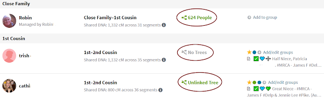
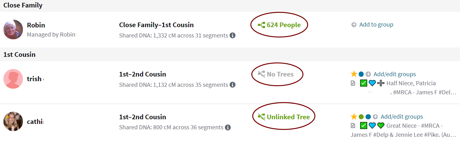
Other default "groups" (shown above/right) that Ancestry provides allow you to only show 4th cousins or closer, only show distant matches, or hidden matches, and as before, only show new matches, starred matches (colored/custom groups being separate from starred matches), or matches with your mother and/or father (if they have also tested). In fact, it now identifies "Mother's Side" or "Father's Side" in the far right column if your parents have tested (shown above). Note this only includes estimated 4th cousins or closer, so if you want to include more distant matches with your parents, you'd have to create a group for it (which is exactly what I've done).

Under filtering, a separate drop down menu (shown left), you can view matches with a "Common Ancestor". This appears to be replacing Shared Ancestor Hints, and it will include speculative ThruLines, so it's basically just another way to view your ThruLines (viewing them by individual match rather than by ancestor, which is what you see when you click on ThruLines from your homepage). The major downside to this, and I have already sent feedback to AncestryDNA on it, is the fact that t
here is no way to view only matches which have an actual common ancestor in both our trees versus those which are much more speculative because it's finding connections through other trees. There should be a way to separate them, as there is a noteworthy distinction between them. If you find this problematic as well, please make sure to send them feedback in the lower right corner of your browser while in beta mode (shown below/right).
Additional filtering includes "matches you haven't viewed". In the past, there was a "new" button which showed all matches you hadn't viewed yet and you could sort them by relationship or date. This is now split up so you can view new matches by date (including ones you've viewed) from the "Groups" drop down menu, or view matches you haven't looked at yet which is sorted by relationship from the "filter by" drop down menu. Personally, I use the latter the most, because I've made a point of looking at each estimated 4th cousin or closer and trying to figure out how we're related, so now when new matches come in, I periodically just look at new estimated 4th cousins or closer and examine them to stay on top of it.
Among the new filtering options include viewing matches you've messaged, matches with notes (very useful!), and matches with private, public, or unlinked trees, the latter being something we've all been asking for for years! Finally!
Best of all, you can combine options between the "Group" dropdown and the "Filter by" drop down menu. So if you want to see matches who you've you've sent a message to and labelled on your Smith branch, for example, you can do that.
 |
| Clicking the circled items opens the old "view match" page with the pedigree preview, etc |
All of these new features and tools could be hugely beneficial, but my main disappointment is in the organization of much of it. In the past, clicking on a match opened the "view match" page we were all used to, including all the most useful features: pedigree preview, surname list, shared matches, map/locations, notes, and the option to message, star, trash, or mark as new. Somewhat recently, there was also added a "compare" button that took us to a different page which showed the comparison of our ethnicity reports, which was very interesting, but typically not very useful. Now with the update, clicking on a match's username takes you to that "compare" page instead, which does include shared matches and potential common ancestors, but does not include the ability to add or edit notes! It also won't show notes of the shared matches listed. Fear not, the old "view match" page with the pedigree preview and other features is still available: from the "compare" page, you can click "pedigree tree" or you can go straight to it by clicking on the tree info in the third column of your match list (even if there's no tree or it's private) - see above (edit: this option has now been removed, in order to get to the pedigree preview page, you can now only do so from the "compare" page). The problem is, the old "view match" page no longer includes Shared Ancestor Hints - in order to view them (now called Common Ancestors, or Potential Ancestors as a part of ThruLines) you have to look at the "Compare" page. And in order to view the details of those potential ancestors (part of ThruLines), it will open a third page! On top of all that, groups can only be added from the match list page, meaning
in order to use all useful features, you have to switch back and forth among FOUR different pages. I can understand ThruLines being on a separate page because it's very detailed, but I see no reason why they can't combine the "Compare" and "View Match" pages and/or add grouping to those pages. It's ridiculous that the features are split among them, it's going to make my workflow that much less efficient. If you feel the same, please use the feedback option to make sure AncestryDNA know!
If AncestryDNA could resolve the two bolded issues, it would be almost perfect - now all we need is a chromosome browser and we're all set, but apparently that's never going to happen due to "privacy" issues.
Coming soon, I'll detail the new features from MyHeritage.


No comments:
Post a Comment