Wednesday, September 16, 2020

Why All the Scotland?

Since AncestryDNA's latest update introduced Scotland as it's own population, separate from Ireland, separate from England, lots of people are getting unexpectedly high results in Scotland. Even people with no known Scottish ancestry are getting significant percentages in that category. And of course, everyone is asking "why?"

For once, Ancestry actually honestly addressed this by explaining that natives to the British Isles have a lot of genetic overlap and can be difficult to tell apart, highlighting the fact that this is still just an estimate or interpretation of our DNA, and it should not be taken too literally.

But Scotland also has a lot of genetic overlap with mainland Europe, and I wanted to share some data and visuals that help illustrate all this. Firstly, although they haven't added the link for it yet, if you pull up the "full history" of the Scotland category (add "/ethnicity/Scotland/history" to the URL after the long that ID number), you'll see it lists all the surrounding areas included in "Scotland" (screenshot above):

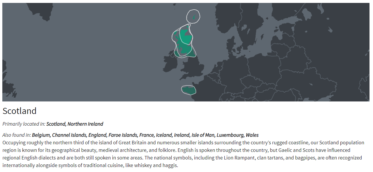
Primarily located in: Scotland, Northern Ireland
Also found in: Belgium, Channel Islands, England, Faroe Islands, France, Iceland, Ireland, Isle of Man, Luxembourg, Wales


That's a big area this category is covering and makes the title of solely "Scotland" seem a little misleading. So is the map, which, apart from Brittany, half of Northern Ireland, and a sliver of Northern England, isn't covering any of the other locations listed here. Brittany, the seemingly rogue area in France that is included in the Scotland map, might seem out of place, but it actually makes a lot of sense. Brittany, as the name suggests, is actually heavily Celtic. In the 5th century, Celtic Britons fled the Anglo-Saxon invasion of Britain and went to what is now Brittany, France. In fact, people there still speak a Celtic language called Breton that bares a similarity to Scottish Gaelic. But Scotland and France were often allies throughout history (united by their shared enemy, the English), so it wouldn't be unusual to see genetic similarities to other parts of France too.

And there's more.

I reference the PCA chart in the ethnicity white paper a lot, and there's a reason for that. It shows us upfront just how much genetic overlap there is among different regions. The latest PCA chart (shown right) is the most detailed yet, including a break down of countries that are lumped into bigger regions in our results.

It can be a little difficult to tell some of the icons apart, so I actually overlaid some colored blobs to show the overlapping regions. Even that can be difficult to tell apart because the overlap is so significant for the British Isles alone. This is why the rest of the British Isles is included in the "also found in" details.


The light blue blob is Ireland, dark blue is Scotland, red is Wales, and dark grey is England. Scotland, Wales, and England in particular are almost indistinguishable, and Ireland still have significant overlap with them. So it's hardly surprising if your break down of the British Isles isn't exactly what you'd expect.

And Scotland has some noteworthy overlap with a lot of mainland Europe too, not all of which are included in the "also found in" details. According to the PCA chart, European countries that have overlap with Scotland include Germany, France, Denmark, Netherlands, Norway, and even Sweden.

It's difficult to even see which countries are included because there's so much overlap.

So basically, if you have ancestry from any of these regions, including the ones in the "also found in" details or the ones in the PCA chart, it could theoretically be turning up in your Scotland results. So the final inclusive list should be more like:

Northern Ireland
England
Wales
Ireland
Netherlands
Denmark
Norway
Germany
Luxembourg
France
Belgium
Channel Islands
Faroe Islands
Iceland
Isle of Man
Sweden

That's all of the British Isles, and the majority of Scandinavia and Northwest Europe.

Granted, AncestryDNA's algorithm may have been able to weed out the likelihood of some of those areas showing up under Scotland (I know they remove PCA outliers), and perhaps that's why not all of these areas are listed in the full details, but that's not necessarily foolproof, so I would still keep in mind that all of these places have some genetic overlap with Scottish samples. 

The PCA chart is very enlightening and anytime you have a question about DNA ethnicity and unexpected results, this chart might be able to answer it. AncestryDNA aren't always very forthcoming about the fact that Europe is so genetically mixed and neighboring regions often share too much DNA to accurately tell them apart, but the PCA chart doesn't lie (though you can generally exclude extreme outliers). I just wish they'd release ones for other parts of the world too, and some for areas where continents mix. For example, I'd love to be able to see how much genetic overlap Southern Italy might have with the Middle East and Northern Africa. I'd also like to see what populations Ashkenazi Jews most closely match (at one point, they were on the European PCA chart, but due to the fact that they were so dissimilar to any other group in Europe, they were obviously removed - I'd love to see if perhaps they are more closely related to Middle Eastern samples than European ones). And of course, not everyone is white and it'd be great if AncestryDNA provided as much background data about other parts of the world as they do with Europe. Providing PCA charts for them would be a great start.

Additionally, AncestryDNA used to have a chart that showed the average admixture for their samples (for people native to each region). For example, it showed us that the average person from the region which was "Italy/Greece" could expect to get about 10% results in the Middle East or Caucasus. It was highly informative in illustrating how genetically mixed some areas are (and also how distinct other populations can be). I have begged AncestryDNA support multiple times to make this data available again, but they refuse. I think they don't want to "confuse" customers too much, but in my experience, the less information you give people, the more confused they'll be. The constant questions about this I see on social platforms prove it.

Friday, September 11, 2020

AncestryDNA 2020 Ethnicity Update is Here!

Well, that was quick. Only days after announcing the update would happen in the next coming weeks, I have received the update already. It may still be rolling out for some people, but I imagine you'll get it in the next few days.

My update in comparison to the last one really highlights once again how much genetic overlap there is among the British Isles, Germanic Europe, and Scandinavia. I have ancestry from all three places, and AncestryDNA (and other companies) can never get them right. With each update, it swings from one extreme to another. The last update, for example, had me at 0% Norway even though I had one Norwegian great grandfather. With the latest update, I'm now 15% Norwegian! This is pretty close to the 12.5% the paper trails says I should be, but of course, we do not necessarily inherit exactly 12.5% from each great grandparent, so 15% is totally plausible, apart from the fact that all other reports usually underestimate my Norwegian ancestry (usually under 10%) which has also lead me to suspect that I inherited less than 12.5% from that particular ancestor. I don't know that though, it's just a hunch, so I can't say 15% is "wrong".

Anyway, here's the full breakdown, in comparison to what it was before.

2019 Estimate:
43% Germanic Europe
22% England, Wales & Northwestern Europe
21% France
12% Italy
2% Greece & the Balkans

2020 Estimate:
27% Germanic Europe
18% Scotland
15% Norway
12% England & Northwestern Europe
12% Southern Italy
11% Northern Italy
5% France

My Italian results have been bumped back up to a reasonable amount (if you recall, I had one Italian grandmother), but they are still lower than what I know they should be. As I've talked about before, my paternal grandfather tested so I know I inherited 18% from him, which means I inherited 32% from my paternal Italian grandmother. So I am fortunately enough to know for a fact that I should 32% Italian. The new results breaking down North and South Italy add up to only 23% (though if that 5% France is coming from my Italian ancestry, then it's 28%). Had my grandfather not tested, I would assume 23% is close enough to the expected 25% and been happy with that, but because I know differently, it's a little disappointing. Additionally, my Italian ancestry is supposed to be entirely southern, not northern, but I'm not hugely surprised they weren't able to tell the difference.

Back to Northern Europe. According to my tree, I should be about 23% Germanic, 32% British (English and Scots-Irish), and as mentioned, 12.5% Norwegian. But I am German and British on both sides of my tree, so really, who knows how much I inherited of each? Especially with the new breakdown of the British Isles into four groups - England, Wales, Scotland, and Ireland - I really haven't even tried to determine how much of my English vs Scots-Irish I might have inherited according to my tree. I do have more recent English ancestry (an English ancestor who immigrated in the 1850s, whereas all Scottish or Scots-Irish immigrated in colonial times), so all I can say for sure is that I can reasonably expect my English results to be higher than Scottish, which they are not. However, combined, they do add up to 30%, which is very close to my estimate according to my tree, and I correctly don't have any results in Wales or Ireland. Of course, this leaves me with 27% Germanic, which is again pretty close to my estimate based on my tree.

So, overall, this new DNA estimate is pretty accurate, if we look at it from a broader view by lumping North and South Italy back together, and England and Scotland back together. If they hadn't tried to split those regions up and just changed my percentages, it would really be spot on.

I can't say the same for my dad's report (right).

The last update in 2019 had my dad at exactly 50% Italian, which was exactly right. My dad's mother was Italian and since we do get exactly 50% from each parent, his ethnicity report should reflect that. A few percentage difference may be within a margin of error, but to get exactly 50% gave me a lot of confidence in the results, so to move away from that 50% even slightly feels like a major downgrade.

Dad's 2019 Estimate:
50% Italy
31% England, Wales & Northwestern Europe
7% Ireland & Scotland
7% France
5% Germanic Europe

Dad's 2020 Estimate:
29% Southern Italy
19% England & Northwestern Europe
16% Scotland
15% Northern Italy
7% Turkey & the Caucasus
5% Norway
4% Germanic Europe
3% Greece & Albania
2% Ireland

According to my dad's tree, he should be 50% Italian, and the other half about 30% Germanic, 20% British (mostly Scottish or Scots-Irish), so to see so many more regions in his list than before instantly felt like a regression. His total Italian results are only 44%, and even if you try to add in neighboring regions like Greece and Turkey, he then has 54%. I know that's not far off 50%, but again, when his previous results were exactly 50%, it feels like a downgrade to deviate from that even slightly.

His Germanic results didn't change much at all, which means it's still being massively under reported, but when you consider that it's probably showing up under the "Northwestern Europe" part of England, it's actually pretty accurate. Combining Northwest Europe and Germanic, he gets 22%, which isn't too far off what his tree estimates. And who knows where that 5% Norway is coming from - could be either his Germanic or British ancestry. That leaves the 16% Scotland and 2% Ireland, which is very close to what his tree is for Scottish and Scots-Irish.

So again, combining specific regions does add up to make some sense, but there's also some regressions.

Over analyzing all my kits might be getting a little tedious, so I'll summarize the rest. My mom's kit (right) went from a very accurate 27% Norwegian (remember, she had one Norwegian grandparent), to a greatly overestimated 46%. She also got 11% in Wales and 10% in Sweden, neither being places she has ancestry in (and that Swedish results can't be coming from her Norwegian ancestry since that would bump it up to 56%, more than double what should be expected).

My paternal grandfather's results at AncestryDNA have always overestimated his British ancestry and underestimated his German ancestry. He should be about 40% British (Scottish or Scots-Irish), and 60% Germanic, but the results are always flipped, and this time is no different, with only 33% Germanic. Granted, he has 38% in England & Northwest Europe, which could go either way. Then he has 27% in Scotland. So what it's really saying is 38% of his DNA can't be distinguished between British and Germanic, which isn't surprising.

Finally, my husband's results (right). My husband is actually a British native - his father was Irish and his mother was mostly English with one Scottish branch and one Irish branch from further back, so he would be roughly 53% Irish, 41% English, and 6% Scottish. His previous results reflected that almost exactly with 43% England, and 56% Ireland/Scotland. So just like with my dad's Italian results, any deviation from that seems like a regression, and that's what happened here too. His new results have him at 41% Ireland, 33% England, and 25% Scotland. For someone who is pretty close to half English and half Irish, this is way off, but that's hardly surprising, since the PCA chart shows there's really not much distinction among these small, neighboring regions so I don't know why they are even attempting to split them up. At least his Genetic Communities are very accurate.

Additionally, the last 2 updates gave my husband 1% noise results in Africa, and for some reason it still remains. I know he's not the only one though, I have seen other reports of people with predominately British ancestry getting 1% in Africa with no known history of it. It's likely just noise, but I wish they'd sort it out already.

So, while I'm pleased that my Italian and Norwegian results accurately went up, the rest of the changes are a bit of a disappointment.

Wednesday, September 9, 2020

AncestryDNA Ethnicity Update in the Works

Recently, AncestryDNA have announced that in coming weeks, they will be rolling out a new ethnicity update with a banner at the top of the DNA homepage. Clicking on the banner takes you to a page that promises new regions and their most precise breakdown yet. It includes a map showing the different coming regions, but we don't get any details beyond the map. It also claims to have over 40,000 samples in their reference panel, and looking at the new white paper shows it's actually over 44,000 which is only a slight increase from the last update which used just over 40,000. With only a minor increase in the samples, that suggests much of the update might be in a change to the algorithm. The FAQ on the announcement page provides a little more info, but it doesn't actually detail what the new breakdowns will be.

Left: European regions before the upcoming 2020 ethnicity update. Right: European regions after the upcoming ethnicity update.

However, we can get a little bit of a preview by looking at our newest DNA matches, who are obviously already receiving the update. If you go to your DNA match list and click "groups" and select "new matches", then look at the ethnicity comparison with them.

From that, you'll be able to see some of the new regions and how they will be broken down. For example, Wales will now be a separate category, no longer lumped in with England/NW Europe, and Ireland and Scotland are now separate categories too.

In southern Europe, Italy will be split up into Northern and Southern Italy (see below). This isn't shown in the before/after map Ancestry's announcement page provides, which is why I say it's not very detailed and I don't think it's giving us the full picture. Additionally, Cyprus will be getting it's own category, no longer a part of Turkey/Caucasus or the Middle East.

It doesn't look like there's much, if any, changes to Africa, Native America, or Asia, but that's because the before/after map on the announcement page isn't reliable. The "before" map seems to actually be using the regions from two updates ago, not what it is now. That's misleading, and if you compare the "after" map to what it is now, there's no difference in Africa, the Americas, or Eastern Asia, only to Europe and West Asia. But the new "after" map doesn't include some new regions we know are going to exist (like Wales). So that map really isn't reliable and doesn't really tell us much. However, the map in the new white paper looks like it does include new areas. It's not interactive and doesn't let us zoom in to see details, but it does appear that there are indeed new regions in other parts of the world too, not just Europe and West Asia. I am not sure why the before/after map on the announcement page is not actually showing the new regions/breakdown when that is supposed to be it's sole purpose.


Left: Africa on the announcement page, supposedly what the update will look like but its exactly the same as it is now. Right: the updated Africa map from the new white paper - what the new regions will actually look like after the update.

They've also already updated their white paper with the European PCA chart.


Here we see quite the breakdown into individual countries, but these are just where their samples come from and don't necessarily reflect how they might group the populations in our results. Like the last one this PCA chart doesn't really show much difference between Portugal and Spain, so attempts to split them up might not be accurate. And of course, we are still seeing massive overlap among all of Northwest Europe. The British Isles, Germanic/France, and Scandinavia all share a significant genetic overlap that still makes them difficult to tell apart in many cases. There are some German and French samples not a part of that group, but there are also many which are. This is understandable since France also shares some overlap with it's neighboring Spain, while Germanic Europe shares DNA with it's neighboring Eastern Europe.

But particularly in regards to the new results splitting up regions like Ireland and Scotland, or England and Wales, I'm skeptical about the reliability of that since the PCA chart shows no new genetic distinction between them.

Additionally, I noticed that European Jewish is missing from the PCA chart, which is a shame because it's always interesting to see how genetic unique they are. And as ever, the PCA chart only includes Europe for some reason, we never get to see ones for other areas, which might be enlightening.

This will be AncestryDNA's third update in three years - does this mean we can expect the norm to now be an update every year, even if it's only some tweaking to the algorithm? We can only wait and see.

Friday, September 4, 2020

AncestryDNA's Inconsistent cM Totals

Edit: See bottom of article for update.

For several years now, because both of my parents took the DNA test, I have noticed certain DNA matches who share more DNA with me than with one of my parents (usually my mom) and none with the other. In most cases, it's only a difference of less than about 5 cM, which is usually small enough that I figure it's nominal and doesn't matter. But I also have many matches where the difference is 10 cM or greater, which is harder to ignore. The greatest difference I've come across so far has been 20 cM. And I know I'm not the only one, I've talked to a lot of other people who have noticed the same.

Recently, AncestryDNA added to the very little amount of DNA matching data they provide, the ability to see the longest shared segment with a match. This has been enlightening, because as many people have already noticed, there are some cases where the longest shared segment is greater than the total amount of shared DNA. Naturally, this isn't genetically possible, and it's left many people confused. AncestryDNA tried to provide an explanation for it:

"In some cases, the length of the longest shared segment is greater than the total length of shared DNA. This is because we adjust the length of shared DNA to reflect DNA that is most likely shared from a recent ancestor. Sometimes, DNA can be shared for reasons other than recent ancestry, such as when two people share the same ethnicity or are from the same regions."

They are trying to keep it simple, but unfortunately I think it serves only to confuse most people even more. Here's what this means.

AncestryDNA have a program called Timber that removes shared segments it believes are not identical by descent (ie, the shared DNA is not coming from an ancestor within a genealogical time frame, but rather from a shared ethnic background). What AncestryDNA's explanation is saying is that they are applying Timber to the total shared DNA, but not to the longest segment. This explains the reason for the inconsistency between the totals and the longest segment, but not the logic or reasoning behind the bizarre choice to apply it to one and not the other. If you find this frustrating, you're not the only one.

What does this mean for the inconsistent shared totals with a match between parent and child? Well, I've noticed that often, when the totals are inconsistent, so is the total and the longest segment, and this tells me the same Timber action that's removing segments from the totals but not the longest segment is probably what is causing the inconsistent totals between parents and children.

Take for example, this DNA match "RB":

RB shares 39 cM across 2 segments with me, longest segment 47 cM
RB shared 19 cM across 2 segments with my mom, longest segment 47 cM


So, my mom and I both actually share one 47 cM segment with RB, but Timber has removed a chuck in the middle of that (making 2 smaller segments). Generally, that's not necessarily a bad thing if that chunk isn't identical by descent, but for some inexplicable reason, Timber took a larger chunk from the shared DNA with my mom than with me. That shouldn't be happening, because it's the same segment, it should be removing the same amount from each. Instead, it's taking the same shared 47 cM segment and removing 28 cM from one person but only 8 cM from the other, and that doesn't make sense, and doesn't exactly instill much confidence in Timber and it's reliability.

My theory on why this is happening is that it may have to do with endogamy. Most of the matches I've noticed with this problem on are my mom's side, particularly from endogamous branches. Granted, my dad has some endogamous branches too, but my mom has a fairly recent Mennonite branch, who are highly endogamous, and many of these matches are from that branch. I don't know whether endgamy is maybe messing with Timber, or Timber is trying to remove endogamous segments, but whatever it's doing, it shouldn't be doing it so inconsistently, and frankly, I can't believe this issue has gone on for so long unresolved (except it's Ancestry, so I can believe it).

Edit (24 Sep 2020): Recently, AncestryDNA added to the DNA data they provide the "unweighted shared DNA" total - which is the amount of DNA you share with a match before Timber is applied. You can find it by clicking on either the longest segment data or the shared total for more information. This means the inconsistencies between the total and the longest segment make more sense, and so do the matches where I share more than my parent does, but I fear it's only going to cause more questions about what an unweighted total is, why there are two totals, why they are sometimes so drastically different, and which total do we rely on? Theoretically, we should be able to rely more on the weighted (Timber) total, but since I don't trust Timber, there is no easy answer to the last question.

But at least I can now see the original total with matches, which unsurprisingly is now much more consistent with the original total they share with my parent. There are a couple that still have a discrepancy of 6 cM or less, but that's somewhat nominal, I suppose.