Showing posts with label admixture. Show all posts

Tuesday, April 17, 2018

Which DNA Company is the "Best" for Ethnicity?

It frequently gets asked which DNA company is the "best", especially based on the ethnicity report alone. It's important to know that the ethnicity report is only ever an estimate, and they can vary greatly among the different companies, but which one is more accurate can also depend on the individual. ISOGG rate 23andMe the highest for ethnicity accuracy, and Nat Geo the lowest, but they don't include LivingDNA in that comparison, and I know from social media, not everyone feels the same way about each company. So I was curious to see what the majority would say if given a survey (if there even is a majority).

Well, here it is. If you've tested with even one of the companies included in the survey (23andMe, AncestryDNA, FamilyTreeDNA, LivingDNA, MyHeritage, and Nat Geo's Geno 2.0) please consider contributing your findings, it will only take a few moments (there are a max of only 13 quick questions, fewer if you haven't tested with every company - it merely asks "have you tested with this company?" and if you answer yes, it asks how accurate you felt the results were): "Best" DNA Company for Ethnicity Survey

Results will be posted once there's enough data collected.

Tuesday, April 3, 2018

23andMe's New Sub-Regions

My new sub-regions from 23andMe
Recently, 23andMe rolled out 120+ new regions in their ethnicity report (Ancestry Composition), but they are actually sub-regions that don't include a percentage (they also aren't included in Chromosome Painting). They are calculated much the same way Genetic Communities at AncestryDNA are, which begs for a comparison.

My initial feelings on 23andMe's new sub-regions are that although they have fewer of them than AncestryDNA's 300+ Genetic Communities, it does seem as though one is more likely to get sub-regions at 23andMe than they would be to get GC's from AncestryDNA. 23andMe correctly identified that my "British & Irish" results are actually from the UK, and my Scandinavian results are from Norway. I also have a sub-region of "Italy" under my existing "Italian" results (see left) - that probably sounds rather obvious, but when you look at the list of all sub-regions, you see that there's also an available sub-region of Malta listed under "Italian" - so once again, they've correctly identified my Italian ancestry and not mistaken it for Maltese.

No European GC's at AncestryDNA
Meanwhile, over at AncestryDNA, I have zero Genetic Communities in Europe (I have one for Pennsylvania Settlers though) - see the screenshot to the right. My dad does get one for Southern Italy because he's half Italian, but no such luck for me. AncestryDNA offer 13 GC's in Great Britain, 17 in Scandinavia, and 14 in Europe South, but I get nada for any of them. 23andMe offer measly 2 sub-regions under British & Irish (UK and Ireland), and only 4 in Scandinavia, but since I actually got sub-region results, I can't complain. AncestryDNA may have more sub-regions, but if there's fewer people getting results in them, then they aren't as useful. 23andMe have certainly just raised the bar a little bit.

It is a little bit of a shame 23andMe weren't able to identify my German ancestry, separate from France and other sub-regions in this group. So far, LivingDNA were the only ones to accurately accomplish this, and it was with percentages.

If you click on "See all tested populations" at the bottom of your 23andMe Ancestry Composition, you'll be able to see that each sub-region, although having no percentage, does show how strongly you match that group with a 5 dot system (shown below). The more dots, the more strongly you match that population. Only if you have 2 or more dots does the group show up on your Ancestry Composition page, but when you click on "See all" you may find you match additional groups with only 1 dot. For example, I have 1 dot for Sweden, but I have no Swedish ancestry and because it's only 1 dot, it doesn't show on my Ancestry Composition unless I click "See all". My existing sub-regions for Italy, United Kingdom, and Norway each have 2 dots, which is why they all show up on my Ancestry Composition page.

Dots showing the strength of my
connection to these groups
You may note that none of your 23andMe percentages have changed, that's because the new regions don't include a percentage. They are calculated differently from the ethnic percentages and use a different reference database. Also, don't assume that having results in a sub-region means they are saying the entire percentage from the parent region is coming from that sub-region. In my case, it's true because I know my family history, but for example, if I also had Irish heritage, the results aren't saying all 17.2% British & Irish is coming from the UK, it could also be coming from Ireland, I just didn't get results for that. I don't actually have Irish ancestry that's not Scots-Irish though.

My previous 23andMe results
for comparison
You may have also noticed that the names of a few populations have changed. This is simply to better reflect the areas they cover, it does not mean the data has changed. Instead of "Middle Eastern" it is now "Western Asian" and "North African" is now "North African & Arabian". What was "Central & South African" is now being called "African Hunter Gatherer" (I'm not entirely sure that's a better description for the newcomers to DNA). Also, "Oceanian" is now called "Melanesian". Originally "Mongolian" is now "Manchurian & Mongolian", and "Yakut" is now "Siberian". Additionally, they appear to have removed the parent categories that once showed the accumulative percentages of some sub-continental regions. For example, it used to group my Northwest European results together - so added up (British & Irish, French & German, Scandinavian, and Broadly NW European) it was 63.3% (show left). That's hasn't changed, if you add up those groups, it's still the same percentage, they are simply no longer showing it so I have to add them up myself. Not a huge loss, but a bit of a shame that I can no longer easily see the divide between my North and South European DNA (which has always been very distinctive).

Here's a complete list of the new sub-regions:

Original 23andMe's populations for comparison
  • European
    • Italian
      • Italy, Malta
    • French & German
      • Austria, Belgium, France, Germany, Luxembourg, Netherlands, Switzerland
    • British & Irish
      • United Kingdom, Ireland
    • Scandinavian
      • Norway, Sweden, Denmark, Iceland
    • Iberian
      • Portugal, Spain
    • Sardinian
    • Balkan
      • Albania, Bosnia and Herzegovina, Bulgaria, Croatia, Greece, Macedonia, Moldova, Montenegro, Romania, Serbia
    • Finnish
    • Eastern European
      • Belarus, Czech Republic, Estonia, Hungary, Latvia, Lithuania, Poland, Russia, Slovakia, Slovenia, Ukraine
    • Ashkenazi Jewish
    • Broadly Northwestern European
    • Broadly Southern European
    • Broadly European
  • Western Asian & North African (formerly Middle Eastern & North African)
    • North African & Arabian (formerly North African)
      • Algeria, Bahrain, Egypt, Jordan, Kuwait, Libya, Morocco, Saudi Arabia, Tunisia, United Arab Emirates, Yemen
    • Western Asian (formerly Middle Eastern)
      • Armenia, Azerbaijan, Cyprus, Georgia, Iran, Iraq, Lebanon, Syria, Turkey, Uzbekistan
    • Broadly Western Asian & North African
  • Sub-Saharan African
    • West African
      • Cabo Verde, Cameroon, Ghana, Liberia, Nigeria
    • East African
      • Eritrea, Ethiopia, Kenya, Somalia, Sudan
    • African Hunter-Gatherer (formerly Central & South African)
    • Broadly Sub-Saharan African
  • South Asian
    • Broadly South Asian
      • Afghanistan, Bangladesh, India, Mauritius, Nepal, Pakistan, Sri Lanka
  • East Asian & Native American
    • Japanese
    • Korean
      • North Korea, South Korea
    • Siberian (formerly Yakut)
    • Manchurian & Mongolian (formerly Mongolian)
      • Kazakhstan, Kyrgyzstan, Mongolia
    • Chinese
      • Hong Kong, Mainland China, Taiwan
    • Southeast Asian
      • Cambodia, Guam, Indonesia, Laos, Malaysia, Myanmar, Philippines, Singapore, Thailand, Vietnam
    • Native American
      • Argentina, Aruba, Belize, Bolivia, Brazil, Chile, Colombia, Costa Rica, Cuba, Dominican Republic, Ecuador, El Salvador, Guatemala, Honduras, Mexico, Nicaragua, Panama, Paraguay, Peru, Puerto Rico, Uruguay, Venezuela
    • Broadly East Asian
    • Broadly East Asian & Native American
  • Melanesian (formerly Oceanian)
    • Broadly Melanesian
      • American Samoa, Fiji, Samoa, Tonga

You can also view a list of populations available from each DNA company here and see how 23andMe compares with other companies.

Wednesday, March 7, 2018

A Gedmatch Admixture Guide: Part 5: Spreadsheets

Also see Parts 1 and 2 on Admixture and Oracle, and Parts 3 and 4 on Admixture Proportions by Chromosome and Chromosome Painting.

Previously, I posted a link to Roots & Recombination's article on Gedmatch's Spreadsheets so I didn't go into it myself when I was detailing how Gedmatch's admixture tools work. However, I've been seeing some people still have questions so I'm going to cover it after all. Not that Dixon's explanation isn't good, but I know for me, it didn't fully click until I realized what I'm about to show you.

To find the Spreadsheet option, run your kit number through your desired admixture calculator (see Part 1 if you need help with this), and under the buttons for Oracle and Oracle, there will be a button for Spreadsheet.

Eurogenes K13 Spreadsheet

Firstly, to clarify this up front, the Spreadsheets are not your personal results. If you look at the Spreadsheet for the same calculator with different Gedmatch kits, they will all be exactly the same. Above is a portion from Eurogenes K13 Spreadsheet - compare it with your own, you'll see it's the same.

So what are they? Basically, the Spreadsheets are showing you what the more specific Oracle populations would look like when run through any particular admixture calculator. So using Eurogenes K13 as an example, the first row for Abhkasian (a small area in the Caucasus mountains) is showing you that when run through Eurogenes K13, the Abhkasian population got 1.64% in North Atlantic, 4.62% Baltic, 9.81% West Mediterranean, 54.30% West Asian, 22.78% East Mediterranean, etc. What this means is that if you were of full Abhkasian descent, you might expect to get admixture results like this.

To illustrate this, note (below) how if you add up the numbers in a single row, they add up to 100% (give or take 0.01-0.03%, as is usual even for your own results, which is probably just due to rounding up or down the individual percentages). So it's showing the admixture results of specific populations as though they were Gedmatch kits.

Spreadsheet for Eurogenes K13 showing sums of all populations

It also shows either how mixed or how exclusive a certain population's DNA is. You might expect an Italian to get results primarily in East and West Mediterranean, and indeed, most of the Italian populations (East Italian, West Sicilian, Italian Abruzzo, Tuscan, Sardinian, South Italian, North Italian, even Italian Jewish) do get high results in those categories (see below). But notice how they also get high results in North Atlantic, meaning that even people from the Southern most areas of Europe still share a lot of DNA with the Northern part of Europe (at least in this calculator). Even East Sicilians are getting 16.46% in North Atlantic.

Italian populations in Eurogenes K13 Spreadsheet

Not only can this explain some unexpected admixture results, but it can also explain unexpected Oracle results. Previously I've talked about how Eurogenes K13 Oracle 4 results matches me to a lot of Jewish populations, namely Kurdish Jewish and some Iranian Jewish. I have no known Jewish ancestry and don't get any Jewish results from any of the big DNA companies. But if I look (below) at Kurdish Jewish and Iranian Jewish in the K13 Spreadsheet, I see they have the highest results in East Mediterranean, which is expected, but also 8-10% in Wed Mediterranean, which is the same category my Italian ancestry peaks in, so perhaps there is some shared DNA there and K13's Oracle is picking up on that in my case.

Population admixtures for unexpected Oracle results 

It's difficult to find a population that gets more than 90% in one category (shown below), but one of the ones that does is Karitiana, a group of Native Americans in Brazil. This population gets 99.62% in (unsurprisingly) Amerindian, and only trace, less than 1% in other categories. The Dai population (a Chinese group) is another, getting 90.46%, again unsurprisingly, in East Asian. And another example is the Papuans (indigenous peoples Papua New Guinea) getting 94.59% in Oceanian. None of this is surprising, as these are all populations which would be expected to be fairly endogamous to begin with, knowing their histories.

The only populations to get 90+% in one category

So while this tool gives us some very interesting information into the make up of each population, and may help provide some insight into how and why your results turned up the way they did, they are not your personal results.

UPDATE: To help better visualize the Gedmatch Population Spreadsheets, I've started creating some bar charts. I'm a visual person, so I find these charts quicker and easier to make sense of than looking at a bunch of numbers. They are interactive so you can hover over sections to get details. If people find this useful, I'll keep adding them.

Eurogenes K13 Population Spreadsheet Chart
Eurogenes K13 Reverse Chart
Eurogenes EUtest V2 K15 Population Spreadsheet Chart
Eurogenes EUtest V2 K15 Reverse Chart

Monday, February 19, 2018

LivingDNA Review

LivingDNA are a British DNA company providing an ethnicity report (autosomal DNA) and a Y-DNA haplogroup (if you're male), and mtDNA haplogroup, for $159 (sales as low as $89 are periodic though). It does not include matching with other testers, although the company says this will be coming in the future, for autosomal DNA (I suspect they're trying to build up their database of testers first). They do offer a way to upload your raw data from other companies for free, however, it's well hidden and hard to find on their site (you can access it here), you won't get your results until August 2018, and it's unclear what the results will include.

UPDATE: They now make the upload easy to find with a new link (the previous URL to apply for their "research" is still available though) and have published some details of the results you'll get. The free upload will include DNA matching with other LivingDNA participants (called Family Networks), and the option to upgrade (for an undisclosed fee) for an ethnicity report. The option to upload will end October 31, 2018, so you need to hurry if you want to be a part of this. It sounds as though they are allowing uploads for the time being primarily to bulk up their database for the roll out of Family Networks.

As a British company, they have focused greatly on British DNA and offer the most breakdown available for this region than any other company at the moment. They also offer the most breakdown for Europe, the Middle East, Native America, and parts of Asia, but they are oddly lacking in any Jewish populations, and their breakdown for Africa and Oceania is fairly average. You can compare their breakdown of populations to other companies here.

But just how accurate are these more specific breakdowns? It's important to remember all DNA ethnicity reports are only an estimate, and in my experience, the more specific the regions are, the more speculative it is. It's difficult to say just how accurate the specifics at LivingDNA are. Of the known locations my British branches have come from, they include: Lancashire, Kent, Scotland, Hertfordshire, Essex, and Suffolk. However, there's probably other locations I don't know about, plus, DNA can go back further than my tree. My LivingDNA results within Great Britain include the
following (also shown on map below):
My regions of Britain and Ireland from LivingDNA
  • South England 8%
  • East Anglia 6.6%
  • Northumbria 6.2%
  • Southeast England 3.8%
  • Central England 3.6%
  • South Central England 2.7%
  • Lincolnshire 2.7%
  • North Yorkshire 2.7%
  • Devon 1.5%
  • Northwest Scotland 1.5%
  • South Wales 1.5%

This is not representative of Lancashire, but it does cover my other known regions, and then some. Unfortunately, Lancashire is my most recent English branch (immigrated in the mid 1800s), so you'd think I'd have more of that than anything, whereas the other areas are from colonial times. Again, it's difficult to say how accurate this may be given that DNA can be more representative of about 1000 years ago, while my tree has only been researched as far back as about a few hundred years. Additionally, given the small percentages, it's entirely possible some of these are just attributed to noise (like a false positive).

What is very consistent with my family tree is that the only result in Ireland I get is actually a part of Northwest Scotland (Scots-Irish). Despite having a couple "Mc's" in my tree, they are all Scots-Irish, not Irish. Also, the total amount of 40.6% in Great Britain & Ireland is very consistent with my known ancestry. I estimate from what I can that my tree is approximately 35% British. Other reviews have been saying that LivingDNA tends to overestimate their total British results, so I was pleasantly surprised to see mine were fairly accurate.

What about the rest of Europe? Here's the results:
  • Europe (South) 30.2%
    • North Italy 17.3%
    • Tuscany 10.4%
    • Aegean 2.5%
  • Europe (North and West) 27.8%
    • Germanic 17.1%
    • Scandinavia 10.6%
  • Europe (East) 1.4% (on "Standard" setting, this is unassigned)
    • East Balkans 1.4%
My Europe South regions from LivingDNA

A total of 30.2% in Southern Europe is somewhat consistent with my tree (I had one Italian grandparent, so 25% on paper), but interestingly it's in almost exact agreement with most other companies. AncestryDNA says 31%, FamilyTreeDNA says 33%, and 23andMe says 29.5%. MyHeritage are the only outliers with 41.6% (which is one of the reasons I feel MyHeritage are the worst for ethnicity). However, looking at LivingDNA's breakdown for it, this is not really consistent with my tree. Most of my Italian branches have been researched back to the 1700s, and they are all from Southern Italy or Sicily, primarily three towns: Monteroduni, Sulmona, and Polizzi Generosa. LivingDNA has my results mainly in upper and mid Italy. You could possibly argue that Monteroduni and Sulmona are right on the boarder of the region they are calling "Tuscany" (the middle portion in pink on the map above/right), but certainly, Polizzi Generosa (Sicily) is not highlighted at all. Granted, the southern tip of Italy is highlighted as a part of the "Aegean" region, but I only get 2.5% in this category. Populations charts (example below) frequently show how North Italy and South Italy are genetically very different, so for my largest results in Italy to be in North Italy when my Italian ancestry is from Southern Italy just doesn't seem right. The entire Italian side of my family are dark haired, dark eyed, with olive toned skin. We are definitely Southern, and that is disappointingly not shown in LivingDNA's results.

Population chart from AncestryDNA - the closer the dots,
the more genetically similar (note the dots for Italy
show two groups, the larger one is northern Italy,
the smaller one is southern Italy,  showing
how genetically different they are)
Next we have a total of 27.8% in North & West Europe, with 17.1% Germanic and 10.6% Scandinavia. This could just be a coincidence, but if not, then a big congratulations is in order to LivingDNA, because they are pretty much the first company to accurately tell my British, Germanic, and Scandinavian DNA apart from one another. Every other company jumps from one extreme to another, or plays it safe by lumping a large portion of my DNA into a "broadly" Northwest European category, unable to break it down further (23andMe). According to my tree, I should be about 25% Germanic (Western Europe) and 12.5% Norwegian (Scandinavian). At other companies, Western Europe ranges from 0% to 17.9%, and Scandinavia ranges from 0% to 12.3%. While the upper ends of these ranges seem on par with LivingDNA, it is always at the expense of the other group (i.e., 12.3% in Scandinavia means 0% in Western Europe). If you're interested, you can see my complete results from all different companies here (although I did not include the sub-regions of Britain, there were too many). It's a shame Germany and Scandinavia can't be broken down further like Great Britain or even Italy are, but hopefully that will change in the future. I'll look forward to seeing how accurate it may be. I also note that LivingDNA was able to accurately tell Germany apart from France, something no other company has even attempted to do.

Lastly, we have the tiny 1.4% East Europe, which they're putting in more specifically in East Balkans (although the map coverage is the same for both). I have no known Eastern European or Balkans ancestry, but it's worth noting that in "Standard" mode, this 1.4% becomes "unassigned". So they are obviously unsure about this, and therefore it's likely just noise.

Similar to 23andMe, LivingDNA provides several levels of speculation or specification for your ethnicity results. There are three modes: Complete, Standard, and Cautious. Complete attempts to identify any "unassigned" DNA found in Standard mode. There was very little difference for me, which is why I used Complete mode here. As I mentioned, there was the 1.4% unassigned which got put in Europe East, and then there was 3% unassigned under Great Britain and Ireland which got put into the 1.5% Devon and 1.5% Northwest Scotland. Cautious mode groups regions more broadly (see below). Within each mode, there is an option to view results on a Global scale, Regional, or Sub-Regional. At Global, I'm 100% European on every mode. This is a little bit contrary to other companies, which often give me at least trace amounts of Middle East, North Africa, or South Asia. 

My results in Cautious mode
In Cautious mode, these are my Regional/Sub-regional results (also shown on map to the right):
  • Great Britain and Ireland 40.6%
    • Southeast England-related ancestry 18.2%
    • North Yorkshire-related ancestry 11.7%
    • East Anglia 6.6%
    • South Wales-related ancestry 1.2%
    • Great Britain and Ireland (unassigned) 3%
  • Northwestern Europe-related ancestry 27.8%
  • Pannonian Cluster-related ancestry 19.8%
  • South Italy-related ancestry 10.4%
  • Europe (unassigned) 1.4%

It's interesting to note that in Cautious mode, there is a 10.4% in "South Italy-related ancestry". It's not a very high amount, but it's interesting that it swapped from North Italy to South Italy for some reason. Meanwhile, my Scandinavian results have strangely disappeared completely. The map above is showing how some areas are found in more than one category. So the grayish blob over Germany is gray because it's in both "Northwestern Europe" and "Pannonian Cluster". Likewise, the brown parts of Britain are brown because they are in both "Great Britain & Ireland" and "Northwestern Europe". These results are more comparable with how other companies group their categories. That doesn't necessarily make it more accurate, just more broad.

My mtDNA haplogroup migration map from LivingDNA
As for the Y and mtDNA haplogroups, I am female so I have no Y haplogroup, and my mtDNA haplogroup is consistent with 23andMe and FTDNA's Full Sequence test: T2b. No revelations there. It includes a written history of the haplogroup, a coverage map, showing countries where your haplogroup is most commonly found, a migration map showing the route your haplogroup took out of Africa, and finally a Phylogenetic tree showing how your haplogroup descends from Mitochondrial Eve (or Y Chromosomal Adam). In comparison, 23andMe only offers the written history, the migration map, and the Phylogenetic tree, no coverage/frequency map. Also noteworthy, while 23andMe and LivingDNA include roughly the same amount of mtDNA raw data (23andMe includes 4,318 mtDNA SNPs, while LivingDNA includes more than 4,000), LivingDNA includes significantly more Y-DNA SNPs (roughly 20,000 to 23andMe's 3,733). Of course, neither of them include mtDNA or Y-DNA matches, so if that's what you're looking for, you'd have to take FTDNA's dedicated tests.

LivingDNA also provides a very detailed, interactive display of your results to share with others. Here's mine. While other companies often provide a similar way of sharing your results, none that I've seen have been quite this detailed or interactive. Does it share too much? LivingDNA also allows you to control what you share by giving you the option to remove elements or widgets.

I was hesitant to test with LivingDNA, given their lack of DNA matching, and the higher price tag, I felt like what you got wasn't worth that much money. Then it was on super sale over Christmas so I decided to take the plunge. I am pleased with the ethnicity report - at regional level, it's been the most accurate for me so far, but the sub-regional results need some work. Particularly if you already know your haplogroups, I wouldn't pay full price for this test, but I do think it's worth exploring, especially if they add DNA matches in the future. 

Tuesday, October 17, 2017

An Oracle Analysis

I'm going to illustrate how I interpret my Oracle results, because I still see a lot of people asking "what do my Oracle results mean?" If you haven't already, you may want to read my intro guide to Gedmatch's Admixture and Oracle, but I'd like to elaborate on that a little bit.

Firstly, it's important to remember that the results can be very speculative and it's best not to take them very literally. People in neighboring regions simply share too much DNA to always be able to tell them apart with accuracy. That means the more narrowed down the areas are in the result, the more speculative it is. You could be German, for example, and get French results because they are neighboring countries who share a lot of DNA. It doesn't mean you're French, it just means this particular calculator put that French/German shared DNA into French instead of German.

Eurogenes K13 Oracle 4, using 4 populations approximation
Secondly, your results are going to be different for each calculator you use so don't just stick to one, explore all those which apply to your background (ie, don't go using Ethiohelix when you're 100% European). Certain calculators may give you more or less accuracy than others. In my personal experience, Eurogenes K13 Oracle 4 (right) isn't very accurate. It really wants me to be Jewish and I'm really not - I have no known Jewish ancestry and don't get any Jewish results from any of the big 4 companies, or in any of Gedmatch's Admixtures. It crops up in the odd Oracle result, but none so much as Eurogenes K13 Oracle 4 populations. I personally have found K15 and EUtest Oracle's to be more accurate, and since K15 is a more recent version of EUtest, that's what I'm going to use to demonstrate how to read Oracle results in some more depth than before.

I find the best thing to do is rather than look at your Oracle results and try to pick one combination that fits you best, or shows the closest distance, look at the results on the whole. Which populations are you seeing the most? Which ones the least? Although I like to look at 4 populations the most because I am primarily from 4 different regions in Europe, you can also look at the 1, 2, and 3 populations modes.

These are my Eurogenes EUtest V2 K15 Oracle 4 results:

1 Orcadian + South_Italian + West_German + West_German @ 4.425306
2 French + South_Italian + West_German + West_Norwegian @ 4.689746
3 South_Italian + Southwest_English + West_German + West_German @ 4.689806
4 East_Sicilian + Orcadian + West_German + West_German @ 4.747531
5 Italian_Jewish + Orcadian + West_German + West_German @ 4.835878
6 East_Sicilian + Southwest_English + West_German + West_German @ 4.850750
7 Italian_Abruzzo + West_German + West_German + West_German @ 4.853912
8 North_Dutch + South_Italian + West_German + West_German @ 4.863277
9 French + Orcadian + South_Italian + West_German @ 4.911067
10 South_Italian + Southeast_English + West_German + West_German @ 4.914701
11 Tuscan + West_German + West_German + West_German @ 4.922722
12 Central_Greek + Orcadian + West_German + West_German @ 4.922800
13 South_Italian + West_German + West_German + West_Norwegian @ 4.927629
14 Irish + South_Italian + West_German + West_German @ 4.941526
15 South_Italian + West_German + West_German + West_Scottish @ 4.958009
16 East_Sicilian + French + West_German + West_Norwegian @ 4.978409
17 East_Sicilian + French + Orcadian + West_German @ 4.982550
18 South_Italian + West_German + West_German + West_German @ 5.005996
19 South_Italian + Spanish_Galicia + West_Norwegian + West_Norwegian @ 5.010231
20 Central_Greek + Southwest_English + West_German + West_German @ 5.011045

So rather than saying the top results must be the most accurate because it's the closest distance, and determining it to be only somewhat accurate because it did identify my German, Italian, and Scottish ancestry, but not my English or Norwegian, let's look at the entire results as a whole.

Map showing my known ancestor's birth
places in Europe
What am I seeing the most? Probably West German. This is very accurate, I have a lot of West German ancestry on both sides of my tree, and I estimate it makes up about 25% of my tree. I also have a couple Swiss-German branches, which is still fairly consistent with West German. There's one ancestor who was from Bavaria, which is a region of Germany more to the east, but I have no idea what part of Bavaria - could have been the western most part for all I know. What I do know is that I rarely ever get admixture/ethnicity results in Eastern Europe and when I do, it's normally in such small portions, it's likely noise. So this is all very consistent with my tree.

I'm also seeing South Italian and some other Italian regions like East Sicilian and Abruzzo. This is incredibly accurate. I do indeed have Sicilian, Abruzzo, and other Southern Italian ancestry. My paternal grandmother was of entirely Italian descent so that makes up another 25% of my tree. My Sicilian branch is a bit more Northern Sicily than Eastern, but that's fairly negligible. There's one count of Tuscan and as far as I know I have no Tuscan ancestry, but that too is probably not very significant since it only shows up once.

There's a few West Norwegians thrown in there, which is also accurate, I have one great grandparent who was Norwegian, making up 12.5% of my tree. Several branches were indeed from Western Norway, although one branch did come from the more Eastern towns of Bamble and Skien.

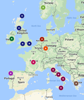
Map showing my population results for
Eurogenes K15 Oracle 4, compare with above map
You may also notice a few Orcadian and West Scottish populations. This is somewhat accurate, I do have several Scottish or Scots-Irish branches dating back to colonial times, but where exactly in Scotland they were from isn't really known. Orcadian (people from the Orkney Islands) seems a little unlikely as my understanding is most Orcadian immigrants went to Canada through the Hudson Bay Company rather than the US. But if we consider Orcadian as a representation of my Scottish or even British heritage, it makes sense. The Orcadians were also influenced by the Vikings, so there's also a potential connection to my Norwegian side. My overall British branches make up about 34% of my tree, and in addition to Scottish, includes English, so it's not surprising to find a few instances of Southeast or Southwest English. As you can see from the map above, I do indeed have ancestry in Southwest and Southeast England, although I have more recent roots in Northern England, near Manchester so it's a shame it didn't pick this up. It's possible Oracle is underestimating my British ancestry, since there's only a few English populations included, but when you consider how genetically similar the British and Germans are, and knowing how many instances of West German are listed, it makes some sense.

I lastly have a smidgen of colonial Dutch and French Huguenot in my tree but I don't know how realistic it is to expect that to show up in admixture results, as it may have been from too long ago. They make up about 1-2% each of my tree. So when I see a few results for North Dutch and French, I'm taking it with a grain of salt. I'd like to think it could be from colonial ancestry but the way Oracle works by identifying the populations you match most closely, it doesn't seem likely I would closely match a population from so far back in my tree. It seems more likely that it's just being picked up from neighboring regions where I have ancestry.

Likewise, I wouldn't put much thought into the remaining few instances of Italian Jewish, Central Greek, Irish, and Spanish Galicia. Irish is probably just representing my British background, as those two groups are closely related, and likewise, Italian Jewish, Central Greek, and Spanish Galicia may be related to my Italian heritage since they're all from that Mediterranean area. In any case, since there's only one or two counts of them, it's easy to ignore them.

So overall, despite the fact that it doesn't always identify my British/English ancestry as much as it maybe should, it's actually remarkably accurate when you look at it on the whole. Compare the two maps above, one showing the origins of my ancestors and the other showing my Oracle results, and they really aren't far off each other (keeping mind some of the locations for the Oracle map cover a larger area than what the pinpoints represent). Mapping it out is another good, fun way to analyze your admixture or Oracle results, if you'd like to try it, just go to My Google Maps.

I don't normally worry too much about the distance unless it starts getting really high. For example, K13's Oracle has closer distances than K15, but the populations in K15 are far more accurate for me than K13. I am NOT saying K15 is the best option for everyone. When I look at my dad's K15 Oracle results, they are mostly inaccurate, constantly insisting he is Lebanese Druze, which seems very off base. I can't even promise that there will be an Oracle calculator that is as accurate for you as Eurogenes K15 is for me, since I haven't really found one for my dad that is this accurate (he does get a lot of Abruzzo results in various calculators, which is accurate, but there's also a lot of populations that are kind of out there for him).

Also keep in mind some of the calculators contain a lot of ancient (prehistoric) populations. If you see some weird names like "Battle Axe" or "Bell Beaker", these are probably ancient populations (Battle Axe is Neolithic, Bell Beaker is western Europe in late Neolithic-early Bronze Age).

I hope this gives some more detailed insight in how you might interpret your own Oracle results. If you are adopted and don't know your ancestral background, it's difficult to know which calculators will be more accurate than others. You should definitely still take all this with a grain of salt, but it is fun to examine and compare with what we do know.

Tuesday, September 19, 2017

A Gedmatch Admixture Guide: Parts 3 and 4

Continuing on from Parts 1 and 2 where I covered the different projects and calculators available for Admixture Proportions and what Oracle is and how to read it, I've had some requests to cover the other viewing options available like Admixture Proportions by Chromosome and Chromosome Painting. So that's what I'll be covering in Parts 3 and 4. For Part 5 on Spreadsheets, click here.

Part 3 - Admixture Proportions by Chromosome

How to find it: From your Gedmatch home page, under "Analyze your data" and then "DNA raw data", choose the option for Admixture (Heritage)" like you did in Part 1, but this time you're going to select " Admixture Proportions by Chromosome" from the bullet list. Be sure to select a project and then calculator and put in your kit number like normal. I would go with whatever calculator you found reflected your known ancestry best. If you haven't read Part 1 yet, you should do so first.

Admixture Proportions by Chromosome shows you your admixture proportions as broken down by individual chromosome; or, in other words, what percentages of each chromosome are most commonly found in which populations/ethnicity. This gives you a much more detailed view of where your DNA is most commonly found.

Admixture proportions (or ethnicity percentages) broken
down by chromosome
So with Eurogenes K13, it shows my chromosome 1 is 28.1% North Atlantic, 15.7% Baltic, 27.7% West Mediterranean, 16.9% West Asian, 10.9% East Mediterranean, and 1.1% Amerindian. This option can often show results in populations that don't show up in a normal Admixture Proportions calculator. However, always keep in mind small percentages may just be from "noise" - like a false positive. I have no Native American ancestry so the 1.1% Amerindian probably doesn't mean anything. You'll also note how I get some North Atlantic results, in varying amounts, on every single one of my chromosomes.

My Eurogenes K13 results
In my normal K13 results, I got 39.03% in North Atlantic, so this is just breaking that average of 39.03% down by chromosome. If you add up all the percentages for one population and divide it by 22 (number of chromosomes) you'll get your overall average for that population. You may note it's a little off from what the admixture calculator originally gave you - for example my average for North Atlantic when each chromosome is added up and divided by 22 is 38.89%, not the original 39.03%. I am not sure why that is, but it's such a small difference I'm not going to worry about it too much. If someone has more information on this discrepancy, please comment below!

At the bottom it says "Number of SNPs eval" - this is just how many of your SNPs were used for the evaluation.

It doesn't show which particular segments each percentage is found on though, but that brings us to the next options.

Part 4 - Chromosome Painting and Reduced Size

How to find it: Same as above, but select "Chromosome Painting" or "Chromosome Painting - Reduced Size" from the bullet list instead.


Chromosome Painting is a visual representation of your admixture proportions not only by chromosome but by segments of each chromosome. The different colors show which segments of each chromosome were most similar with which populations. When there are overlapping colors on the same segment, it means that segment is found in more than one population. The higher the spike, the stronger the match to that population. So segments where there are solid blocks of one color are more solidly found in only that population. Above is just a small portion of one of my chromosomes (7, I believe), as an example of the various populations that will show up for any given segment.

You'll note there are numbers along the bottom of each chromosome - this is marking the amount of base pairs in millions. One centiMorgan is one million base pairs. So if you have a segment painted with a certain color stretching from "10M" to "20M", for example, that's 10 million base pairs, or 10 cMs. Don't get too excited if you see colors for some unexpected populations - small segments could just be noise.

Chromosome painting reduced size
The reduced size option just condenses it so it's easier to view on a single screen. After viewing the full size, you'll quickly see just how cumbersome it is to get an overview, so the reduced size is ideal for that. The full size is better for examining particular portions. They don't label each chromosome but they are listed chromosome 1 to 22, from left to right. They are also rotated so the start of the chromosomes are at the bottom.

You may notice in either the full or reduced size that similar populations (though it's more noticeable in full), or neighboring regions, often spike and dip almost in unison with each other. This is because neighboring regions tend to share a lot of DNA and be genetically similar so when you see this, what you're seeing is that these portions of your DNA may be somewhat indistinguishable among two or more groups. This is important in understanding that not all DNA can be narrowed down to the more specific areas or countries that so many people wish it could, not with any reliability. It also illustrates why you might get results in a region that you have no known ancestry in when it neighbors a region you do have ancestry in.

23andMe's chromosome painting
If you tested with 23andMe, you may be somewhat familiar with chromosome painting already. 23andMe's option for it is a little more straight forward. It doesn't have all the spikes and dips, just solid blocks showing which segments were put into which groups (shown left). However, it does show the two sides of each chromosome whereas Gedmatch doesn't seem to do this. Although in some ways, Gedmatch's painting is more detailed, it is essentially the same concept, just a slightly different approach.

As another example, below is also a graphic from 23andMe - it's not a part of your results from this company, it's just showing, in part, how they determine ethnicity. Their example uses the more detailed type of chromosome painting found at Gedmatch, and it is labelled to show the probability of each ancestry on one side with increasing percentages of likelihood. It can be found in their guide article on ancestry composition. Gedmatch's chromosome painting can be read the same way (ie, the higher the peak, the higher the probability of that segment being from that population).


Disclaimer: Please note I am not a professional in the genetics industry, and it is difficult to find information particularly on some of the more advanced admixture tools on gedmatch. This is how I have come to understand the results and tools through my own experiences and research, but please, if someone more knowledgeable can correct me if I've misunderstood something, or can fill in some gaps, let me know by commenting below.

Thursday, April 6, 2017

Finally! A Gedmatch Admixture Guide!

Update: I think perhaps I was not clear enough when originally writing this that ethnicity/admixture is only an estimate or interpretation of your DNA, it is NOT an exact science and different interpretations often yield wildly different results. It's usually accurate on a continental level, but sub-continental regions generally share too much DNA to always be able to reliably tell them apart. That is why most of Gedmatch's calculators often cover broad areas. The more specific an area is narrowed down too, the more speculative the results are. Plus, different sample groups and different algorithms will always produce different results and there is no one option that is always going to be more reliable than any other. While the ethnicity reports can be fun and interesting to explore, which is why I wrote this guide, they really should not be taken literally. You should not attempt to use them to definitively prove your ethnic origins (on a sub-continental level), or exact amounts of any given ethnic origin, or a specific geographic path your ancestors might have taken over time, or especially to confirm a specific ancestor's identity. If that is what you're looking to do (particularly the latter), you are better off working with you DNA matches (if you have not opted into matching, you should seriously consider it, since that is where the true value of the test lies). Additionally, be aware that Gedmatch's admixture calculators haven't been updated in years (though all of this still applies to other companies who have provided updates more recently). With all that in mind, I hope this guide is useful to helping people understand the different interpretations of their DNA available on Gedmatch. Have fun, but remember, don't take it too seriously.

For those unaware, Gedmatch.com is a website where you can upload your raw DNA data for further analysis and matching with people from other companies who have also upload their data.

Parts 3 and 4 on Admixture Proportions by Chromosome and Chromosome Painting now available.

Part 5 on Spreadsheets is now available.

Part 1 - Admixture Proportions

Introduction
Despite all the help articles available on Gedmatch.com, none of them really offer a comprehensive guide to understanding the admixture calculators for newbies. Most of them are guides on understanding DNA in general, or how to upload your data, or using the one-to-many or one-to-one tools. In fact, there is a very good beginners guide to the matching side of things found here. But the most common questions I see about Gedmatch are “which admixture calculator do I use?” and “what do the results mean?” There is a Gedmatch wiki page on admixture, and there is Kitty Cooper's slide presentation, but I don’t think they really answer all the questions most people are looking for, especially regarding Oracle. Even Googling the topic only turns up spotty results from forums and blogs, nothing that really lays it all out. Since no one else has done it, here is my attempt. Please keep in mind I am no expert and have no formal education in genetics, this is just the knowledge I’ve gathered over the years from various sources as a result of trying to understand my own DNA results.

Admixture is a scientific term for the ethnicity percentages you received from a DNA company like Ancestry.com, FamilyTreeDNA, 23andMe, or MyHeritage. It’s important to understand that each admixture project on Gedmatch is created by a different person, mostly academics. Note that most of the admixture results will include some basic info on the calculator, either on the results page, or through a link from the creator. However, the info provided may still be technical and difficult to understand for the average person, because they were primarily created for academic purposes. This is an attempt to translate some of that info into something more understandable to the average user. I apologize that this guide favors info on European backgrounds, but that is simply what I’m most familiar with, being a European descendant myself.

Be aware that it’s common practice in DNA admixtures to refer to populations from prehistoric times as “ancient”, even though this is a bit of a misnomer. In historical terms, ancient history marks the beginning of recorded history, but here, “ancient” generally refers to the time before written history, prehistory. Some time periods might be specified as “neolithic”, or “paleo/paleolithic” etc.

Select a project from the drop down menu, leaving the other
options as they are, then click "continue"
Step 1: Pick a project.
There are 7 projects to choose from in the Admixture (Heritage) tool (found under "Analyze your data" and "DNA raw data"), but what are they? What do they mean? Which one should you pick? Here’s a basic breakdown:

(Note: below the projects drop down menu there are options like "Admixture Proportions (with link to Oracle)" and "Chromosome Painting", etc. Don't mess with those for now, just stick with the top default option, Admixture Proportions (with link to Oracle), as that is what this guide will cover.)

  1. MDLP
This is a global calculator and attempts to break your results down into different parts of the world. It’s good as an overview, but if, for example, you already know you’re European, it’s probably unnecessary. It’s also heavy on ancient groups. The blog for this project is found here: http://magnusducatus.blogspot.com/

  1. Eurogenes
As the name suggests, this is primarily for people with European backgrounds. While it does have populations outside Europe, there are usually more sub-continental regions for Europe than any other continent. I highly recommend this as the go-to project for people with sole European ancestry. The blog for this project is found here: http://bga101.blogspot.com.au/

  1. Dodecad
This project says it focuses primarily on Eurasians, but most of the calculators are geared more towards Asian and African ancestry than European. It’s not ideal for Europeans, but may be useful for people with mixed ancestry. The blog for this project can be found here: http://dodecad.blogspot.com/

  1. HarappaWorld
This calculator is primarily for people with South Asian ancestry. The blog for this project can be found here: http://www.harappadna.org/

  1. Ethiohelix
This is an African based project, though it does have options for people with mixed backgrounds (but always including African). There is no Native American in this project at all. The blog for this project is found here: http://ethiohelix.blogspot.com/

  1. puntDNAL
This is primarily a project on ancient DNA. There is no website, but questions and comments about should be directed to Abdullahi Warsame at puntdnalking@gmail.com

  1. GedrosiaDNA
This project focuses primarily Eurasian (especially Indian and Asian) and ancient DNA. There is no website, but for further questions, please contact the creator at Dilawerkh4@gmail.com


Once you've selected a project, you need to enter your kit
number and then select a specific calculator.
Step 2: Pick a calculator.
You’ll find that for each project, there are often several calculators to choose from. How to choose? What do they mean? What are the differences? Well, for starters, the numbers following a ‘K’ indicate how many populations (or regions/categories) that calculator includes. So for example, Eurogenes EUtest V2 K15 has 15 populations. So choose one depending on how many regions you want to break your results down into. Keep in mind the more populations and therefore the more specific the regions are, the more speculative the results will be.

Don't forget to put in your kit number - if you've forgotten it, go back to the home page and copy it.

Certain other tests may be specific to deeper, more ancient (prehistoric) ancestry, like Hunter-Gatherer vs Farmer. Any abbreviation that starts with ‘A’ probably stands for ‘ancient’, but I will post a comprehensive terminology list at the end of this guide. These calculators for ancient DNA aren’t very useful if you’re just looking for an opinion on your more recent ethnicity results.

Other calculators might be specific to certain types of ancestry. For example, Eurogenes’ Jtest is specific to Ashkenazi Jewish ancestry. There’s no need to run this test if you don’t have any Jewish ancestry. In fact, you might get false results in Ashkenazi if you run this calculator and have no Jewish ancestry.

(Note: ignore the option below the calculator drop down menu, this is for data collection purposes. If all 4 of your grandparents are from the same ethnic group and you want your DNA to be a part of the sample groups they use to create these calculators and determine populations, then go ahead and fill it out. Otherwise, you can ignore it.)

Here’s a more detailed breakdown of each calculator. I've also created a spreadsheet listing the populations included for each calculator, along with my recommendations for good calculators to use based on your ancestry or what you're looking for.

MDLP
  • MDLP K11 Modern - 11 global populations including ancient
  • MDLP K16 Modern - 16 global populations including ancient and modern - results page includes full population descriptions
  • MDLP K23b - 23 global populations including ancient
  • MDLP World22 - 22 global populations including ancient, full details including maps of what areas each category covers are found here - there are several Native American categories so this may be ideal for Native American ancestry
  • MDLP World - 12 global populations, probably the original MDLP calculator

Some Population Maps
for Eurogenes ANE 
Eurogenes
  • Eurogenes K13 - 13 global populations, mostly European. Creator made this the default as it “seems to hit the spot for most people” with European background. Details here
  • Eurogenes EUtest V2 K15 - 15 global populations, mostly European, also a popular option. Details including regional maps for each category found here
  • Eurogenes ANE K7 - 7 populations, Ancient North Eurasian, meaning this looks at ancient DNA mostly in Europe, Western Asia, and Africa. Details found here and some maps available here
  • Eurogenes K9b - 9 global populations, approximates Geno 2.0 analysis
  • Eurogenes K9 - 9 global populations, map available here (population descriptions no longer available)
  • Eurogenes K10 - 10 global populations, map available here (population descriptions no longer available)
  • Eurogenes K11 - 11 global populations, map available here (population descriptions no longer available)
  • Some population maps
    for Eurogenes K36
    Eurogenes K12 - 12 global populations. North European ancestry is said to do well with this calculator. Map available here (population descriptions no longer available)
  • Eurogenes K12b - 12 global populations, excluding Native American (Amerindian), map available here (population descriptions no longer available)
  • Eurogenes K36 - 36 global populations, mostly European. This is the most detailed breakdown for Europeans, but that also makes it highly speculative. Details found here and maps available here - there's also an interesting application that will map out your personal K36 results
  • Eurogenes Hunter-Gatherer vs Farmer - 12 ancient Hunter-Gatherer vs Farmer populations. Map available here
  • Jtest - Jewish Ashkenazi, 14 global populations but mostly European, this is essentially the EUtest with an Ashkenazi category. Details including maps are here
  • EUtest - 13 global populations, mostly European minus Jewish Ashkenazi. Details including maps are here
Some Dodecad K12b
Population Maps

Dodecad
  • Dodecad V3 - 12 populations, mostly Asian and African, 2 European, no Native American. More info
  • Africa9 - 9 populations, all African except one European (no Asian, no Native American). More info
  • World9 - 9 global populations, not specific to any continent so good as an overview regardless of your ancestry. More info
  • Dodecad K7b - 7 populations, mostly Asian, 2 European, 1 African, no Native American. More info
  • Dodecad K12b - 12 populations, mostly Asian, 3 African, 2 Middle East, 2 European, no Native American. More info and population maps

HarappaWorld
  • HarappaWorld only has one calculator and as explained above, it’s primarily for South Asian ancestry. It does include some European, African, and Native American populations, but its focus is on South Asian: Indians, Pakistanis, Bangladeshis and Sri Lankans.

Ethiohelix
  • EthioHelix K10 + French - 10 populations, 9 African, one “French” which acts as a European population. This is really only useful/accurate for people with mixed African and European ancestry. Maps available here
  • EthioHelix K10 + Japanese - 10 populations, 9 African, one “Japanese” which acts as an Asian population. Only useful for people with a mix of African and Asian ancestry. Maps
  • EthioHelix K10 + Palestinian - 10 populations, 9 African, one “Palestinian” which acts as a Middle Eastern population. Only useful for people with a mix of African and Middle Eastern ancestry. Maps
  • EthioHelix K10 Africa Only - 10 strictly African populations, nothing else. Do not use if you have no African ancestry as results won’t be accurate. Maps

puntDNAL
  • puntDNAL K10 Ancient - 10 ancient populations, incorporates Caucasus HG as well as Early Neolithic Farmers and Western European HG.
  • puntDNAL K12 Ancient - 12 populations, utilizing ancient oracle, more info provided on results page
  • puntDNAL K12 Modern - 12 populations utilizing modern oracle, more info provided on results page
  • puntDNAL K13 Global - 13 modern populations, focuses primarily on Asia (6 Asian populations, 3 African, 2 European, 1 Oceania, 1 Native American). From the creator: "The impetus in creating this calculator was the release of the Southeast Asian study, which inspired me to create a calculator that included a Southeast Asian component and give my Southeast and Northeast asian people a more accurate calculator for their ancestry." Population details
  • puntDNAL K15 - 15 populations, focuses primarily on Africa (particularly East Africa), but also includes some West Asia, and Europe. More info
  • puntDNAL K8 African only - 8 populations, as the name suggest, it’s strictly an African calculator

GedrosiaDNA
  • (Removed) Eurasia K9 ASI - 9 populations, modeled around the ancient Ancestral South Indian component, no Native American. More info on population descriptions
  • (Removed) Eurasia K10 CHG - 10 ancient populations, modeled on Caucuses Hunter Gatherers, more info on population descriptions
  • (Removed) Eurasia K11 CHG-NAF - 11 ancient populations, modeled on Caucuses Hunter Gatherers and Neolithic Anatolian Farmers, more info on population descriptions
  • Gedrosia K3 - 3 populations, Eastern Eurasian, Western Eurasian, and Sub-Saharan African. More details
  • (Removed) Gedrosia K15 - 15 populations with a focus on the Indian subcontinent. Population descriptions
  • (Removed) Eurasia K14 - 14 populations, using the same Neolithic and Bronze Age source data as the K14 Neolithic calculator, plus some modern populations
  • (Removed) Eurasia K14 Neolithic - 14 global populations, focus is on ancient Neolithic and Bronze Age genomes from across Eurasia. Population descriptions
  • Gedrosia K12 - 12 populations, designed for individuals of predominantly South Asian and West Asian ancestry for inferring gedrosian Balochi admixture. No Native American. More info
  • (Removed) Gedrosia K11 - 11 populations with a focus on Kalash Indo European peoples of Pakistan. Population descriptions
  • Ancient Eurasia K6 - 6 ancient populations, primarily Europe, Asia, and in between, 1 African, no Native American. Further descriptions are available on results page.
  • (Removed) Near East Neolithic K13 - 13 ancient populations, with a focus on the Near East. Details provided on results page.


Step 3: Understanding the results: A Terminology Guide
A list of populations you might see and a brief description. I did not include some of the most self-explanatory ones. Some that I have listed might still be obvious to some people, but I’ve seen others ask about them on occasion. If there isn’t one listed here, you might learn a lot by just googling it. There is also a good abbreviation guide here: https://isogg.org/wiki/Abbreviations
Keep in mind different calculators may use different terms to refer to the same region or population.

  • Amerindian or Amerind - Native American (ie, American Indian meshed into one word)
  • Anatolian - mostly Turkey
  • Ancestral Altaic - Asia (excluding South), and Eastern Europe
  • ANE - Ancient North Eurasian
  • Archaic African - broad category for prehistoric Africans
  • Archaic Human - broad category for prehistoric humans around 500,000 years ago
  • ASE - Ancient/Ancestral South Eurasian
  • Ashkenazi - Ashkenazi Jewish of central/eastern Europe (not the same as Sephardic Jewish)
  • ASI - Ancient/Ancestral South Indian
  • Australian - aboriginals of Australia
  • Australoid - “people indigenous to Southeast Asia, South Asia, Australia, Melanesia, Polynesia, Micronesia, and historically parts of East Asia.” (Wikipedia)
  • Austronesian - “relating to or denoting a family of languages spoken in an area extending from Madagascar in the west to the Pacific islands in the east.” (Google)
  • Baloch - people of Iranian Plateau and Arabian Peninsula (primarily the Middle East)
  • Baltic - regions surrounding the Baltic sea
  • Bantu - Central and south Africa
  • Basal - Basal Eurasian?
  • Beringian - areas surround the Bering Strait (Eastern Russia and Alaska)
  • Biaka - aka Aka, “nomadic Mbenga pygmy people who live in southwestern Central African Republic and the Brazzaville region of the Republic of the Congo” (Wikipedia)
  • Caucasian/Caucasus - people of the Caucasus region, the border between Europe and Asia in between the Black sea and the Caspian Sea
  • CHG - Caucasus Hunter Gatherers
  • EHG - Eastern Hunter-Gatherer
  • ENF - Early Neolithic Farmer
  • Fennoscandian - Scandinavia and Finland
  • Gedrosia - Modern day Makran (semi-desert coastal strip in Balochistan, in Pakistan and Iran, along the coast of the Persian Gulf and the Gulf of Oman)
  • Khoisan - Southern Africa
  • Mbuti - “one of several indigenous pygmy groups in the Congo region of Africa” (Wikipedia)
  • Melanesian - “a subregion of Oceania (and occasionally Australasia) extending from the western end of the Pacific Ocean to the Arafura Sea, and eastward to Fiji.” (Wikipedia)
  • Mesoamerican - Native American in Mexico, Central and South America
  • NAF - Neolithic Anatolian Farmer
  • Oceanian - Aboriginals of the Pacific Ocean islands (may include Australia depending on calculator)
  • Omotic - Southwest Ethiopia
  • Papuan - New Guinea and surrounding islands
  • Pastoralist - Sheep or cattle farmer
  • Pygmy - “certain peoples of very short stature in equatorial Africa and parts of Southeast Asia.” (Google)
  • San - Bushmen of southern Africa
  • SEA - South East Asian
  • SSA - Sub-Saharan African
  • Steppe - “ancient North Eurasian hunter-gatherers' heritage, which was subsequently shown to have an influence in later eastern hunter-gatherers and to have spread into Europe via an incursion of Steppe herders” (MDLP K16)
  • Tungus-Altaic - Northeast China and Siberia
  • WHG - Western Hunter-Gatherer
  • WHG-UHG - Western Hunter-Gatherer/Unknown Hunter-Gatherer
  • Volga-Ural - Part of Russia (central)


Conclusion
Which project and calculator you go with greatly depends on your known ancestry. I know all this info is probably still a little overwhelming even with (or perhaps because of!) this guide. If you’re of European descent, and a newcomer to Gedmatch, and you just want a second opinion on your ethnicity results from any of the Big 3 companies (Big 4 now maybe, with MyHeritage joining the bandwagon), I’d recommend Eurogenes K13 or K15. Personally, I tend to prefer K15, because there are maps available showing specifically what regions are covered by which populations. Certainly, you can play around with any of the other Eurogenes calculators too (except Jtest if you’re not Jewish). Most of the other projects and calculators are either geared more towards ancient DNA, other continents, or a mixed ancestry. You may find a non-bias global calculator in some of the other projects, but it’s probably not going to provide the breakdown of Europe you’re looking for.

If you’re looking for an ancient calculator, I again tend to stick to one of Eurogenes’ (HG vs F, or ANE), but MDLP have some good options too. There’s also a couple in puntDNAL which I don’t think have a bias towards any one type of ancestry.

If you’re African, Asian, or of mixed heritage, there are a number of options to choose from, but I unfortunately can’t recommend any over any others. Most global calculators will include Amerindian (I have noted when one doesn’t), but MDLP World22 seems to have the most categories for Native Americans and may be ideal for that.

I was surprised to realize Eurogene's Jtest is the only one that offers an Ashkenazi (or other Jewish) category, so if you're Jewish, it looks like this is your only option. However, it should be noted that there are many Jewish populations typically included in Oracle/Oracle 4 (see below for more details), not just for Jtest but any other given calculator too. For your reference, I created a spreadsheet that shows which calculators have what Jewish populations available in Oracle/Oracle4.

If you're adopted and don't know what your ethnic background is, is important to remember that there's never going to be one defining ethnicity or admixture report that tells you "this is your ancestry" with any total accuracy. However, I understand the desire to know where you came from, so what I'd recommend is gathering as many reports as you can (within reason - if you're obviously white, there's no sense running an African-only calculator) and compare them in a spreadsheet like I've done here. It will help you spot any consistencies, or see what populations show up most frequently in the highest numbers.

It is frustrating that maps, or at least population descriptions, aren’t available for every calculator, but this is a free service, after all. It’s actually pretty amazing all the work the project creators do to provide this for free.


Part 2 - Oracle
Say what now?

Introduction
The second most common questions I see about Gedmatch are about Oracle. What is it? What do the results means? Oracle is an attempt to pinpoint your origins to a more specific population or region. You'll find many are narrowed down as specifically as regions within countries, or specific religious groups. There are two options: Oracle and Oracle 4. You will find buttons for them listed under your admixture results. Note that not all admixture calculators have Oracle available so pick a calculator that both suits your background and offers Oracle. There is a third button which just says "Spreadsheet" but this is covered this later. There is a also good explanation for this from Roots & Recombinant DNA.

Oracle
Oracle will list your admixture results, then something called Single Population sharing, and finally Mixed Mode Population Sharing.

  • Single Population Sharing attempts to pinpoint a specific, single population that your DNA most closely matches, with a list of the top 20. The distance will tell you how closely you match each group, so the smaller the distance number is, the more closely you match. It is assuming your ancestors all came from the same area/population (so if they didn't, this is probably not ideal for you and the results may not make sense).
  • Mixed Mode Population Sharing will show you your top 20 of two specific, combined populations in order of how closely you match those populations. It is assuming your ancestors came from only two locations/populations (though not necessarily split 50/50). Again, the distance will tell you how closely you match this combo of populations, while the percentage will tell you how much of your DNA matched which population.

Oracle 4
Oracle 4 is essentially the same as Oracle, except it expands on it by providing combinations of 3 and 4 specific populations. The single and double combinations can be different from original Oracle though, so don’t bypass Oracle thinking you’ll get that and more with Oracle 4, it may be best to examine both depending on your ancestry.

  • Using 1 population approximation works the same as Single Population Sharing in Oracle, but I’ve noticed the results are sometimes different, so they’re obviously using a slightly different calculation. Reading the results works the same though: they are showing you a list of specific populations you most closely match, with the distant showing you just how closely you match. Again, this is intended for people whose ancestors all come from the same population.
  • Using 2 population approximation also works similarly to Mixed Mode Population Sharing but you'll notice that the percentages are always 50/50. That's because it's assuming that you have one parent from one population, and the other from another, so you would be 50/50. If that's not the case, this is not ideal for you. For some reason this only lists your top 1 result instead of the top 20. Again, the distance tells you how closely you matched this combo of populations.
  • Using 3 population approximation works the same as 2, but with a combination of 3 populations instead. So it's assuming you have one parent from one population and on your other side, you have a grandparent from a different population, and the other grandparent from a third population. This is why one population will be 50%, and the other two are 25%. It only lists one result. You know what the distance means by now.
  • Using 4 population approximation uses a combination of 4 specific populations you most closely match and lists your top 20 combos. This was designed for people who have 4 grandparents from 4 different places but it can sometimes also work well if most of your ancestry is mainly from 4 different places/populations (because it does not include percentages).

Conclusion
Be aware that the results from Oracle and Oracle 4 will vary depending on what admixture calculator you used, which is why they are found on the admixture results page, and not as a separate calculator. Also keep in mind the results are speculative, but I have found they do often make some sense, and in some cases, can be remarkably accurate. Check out my blog post on a deeper analysis of my Oracle results here. However, if you do not fit the scenarios described of having parents or grandparents from one location, the results may not be reliable for you.

A lot of ancient populations in Oracle will likely have unfamiliar names but there's a good a map showing where many of the samples for the ancient populations came from available here.

If you feel like you've got a good handle on this, continue onto Parts 3 and 4, Admixture Proportions by Chromsome and Chromosome Painting.