Showing posts with label ethnicity. Show all posts

Saturday, September 24, 2022

Eurogenes K13 Charts and Maps

I know for many people like myself who are visual people, seeing a map of where exactly each region covers can be really beneficial to understanding your Gedmatch Admixture results. There's already some official European maps available for Eurogenes EUtest V2 K15 from the Eurogenes blog, and you can sometimes find some unofficial ones for other calculators, but I haven't seen any for Eurogenes K13, so I gave it my best shot.

Anyone can make these maps with the right tools - the data is readily available from the Population Spreadsheets for each calculator. The difficult part is that the tool I used to create the map was in Google Spreadsheets Charts, which only recognizes modern country names. So I had to categorize every specific population into a modern country. Not easy considering many countries included several populations (I simply averaged them) and many of the populations span several countries (I just put the data in all relevant countries). But still, it wasn't easy, so it's safe to say these are very much unofficial maps, not endorsed by the Eurogenes creator. They are interactive, so hover over each region for the percentage. If anyone can recommend a better free mapping program, please let me know!

K13 North Atlantic Map - essentially a "Northwest Europe" region primarily including British Isles, Scandinavia, and Germanic Europe, though as you can see, it also includes most of Europe to some degree.

K13 Baltic Map - primarily the Baltic States (though data is missing for Latvia) and surrounding areas, though again, you can see most of Europe is included to some degree.

K13 West Med Map - primarily areas that border the western portion of the Mediterranean Sea (both Europe and North Africa), also including the eastern portion of the Mediterranean area to a lesser degree.

K13 West Asian Map - peaks in the Caucasus region, includes surrounding areas (does not include all of Russia, there's just no way to break down the maps more).

K13 East Med Map - primarily areas bordering the eastern portion of the Mediterranean Sea (leaning more heavily to the North African and Middle Eastern areas), though it appears to peak in Yemen, that's due to the Yemen Jewish sample getting the highest results in this category.

K13 Red Sea Map - mainly be areas bordering the Red Sea, though data in some African areas is missing, it peaks in the Arabian Peninsula and Horn of Africa, yet also includes all of North African to some degree.

K13 South Asian Map - peaks in India, Bangladesh, Nepal, and Pakistan, including surrounding areas in varying degrees.

K13 East Asian Map -coming soon.

K13 Siberian Map - coming soon.

K13 Amerindian Map - coming soon.

K13 Oceanian Map - coming soon.

K13 Northeast African Map - coming soon.

K13 Sub-Saharan Map - the area south of the Saharan desert, peaking in West Africa and Bantu regions, but also covering parts of North Africa to a much lesser degree. Data for some areas is missing.

I also created charts showing what percentage each sample population got for each region, so you can get an idea of what each region includes even for the areas I haven't done maps for yet:

K13 Population Chart (by population)

Despite having done all this, I do want to clarify that Gedmatch's Admixture calculators have not been updated in many years, and the reference panels used for them are very small in comparison to the consumer testing companies, so you should definitely take the results with a large grain of salt.

Wednesday, July 20, 2022

A Chromosome Painter Comparison

Recently AncestryDNA added yet another feature to their DNA tools, a Chromosome Painter. It shows us which portions of our chromosomes they have identified as coming from which regions. It's found under SideView because there's also a breakdown by Parent 1 and 2. AncestryDNA joins 23andMe and FamilyTreeDNA in offering this feature (leaving MyHeritage as the odd man out), so I decided it was time to compare them.

For me, it's easiest to analyze my Italian ancestry since it's genetically more distinct from the rest of my ancestry which is Northwest European. At Ancestry, it's mostly identified correctly as Southern Italy (22%), and some as Northern Italy (9%). At 23andMe, it's primarily put into Italy (23.6%), with a little bit in Greece/Balkans (1.6%), Cyprus (3.2%), and Anatolia (1.6%). A few other less than 1% results in various Southern Europe/West Asia areas add up to only 1.2%. FamilyTreeDNA isn't quite as accurate, but at least they get most of it in Southern Europe, with 28% in Greece/Balkans and only 8% in the Italian Peninsula. However, as you can see, the totals add up to approximately the same amounts at each company: 31% at AncestryDNA, 31.2% at 23andMe, and 36% at FTDNA. This is consistent with the fact that my paternal grandmother was Italian and since my paternal grandfather tested, I know I share 18-19% (depending on the company) with him, leaving 31-32% I obviously got from my Italian grandmother (totaling the 50% from my dad).

Knowing that the percentages are fairly consistent, I wanted to see if the individual segments identified in these regions would be consistent across all companies as well. Overall, there was reasonable consistency between 23andMe and AncestryDNA, but FTDNA was all over the place. Let's look at it chromosome by chromosome, at least on a few of them (I don't think I need to go over all 22 of them).

Chromosome 1

AncestryDNA shows almost the full length of one side of chromosome 1 is Southern Italian (above), apart from a small portion at the end. 23andMe shows the first and last portions of the chromosome as Italian (below, first), with the middle bit missing, but interestingly, it seems at least some of that middle bit is identified as Cypriot (below, second).


Obviously, there's some overlap there and it's saying they're on opposite sides, but there's no way either Italian or Cypriot is coming from my mom's side since she is 100% Northwest European - British, German, Norwegian. So although it may not align perfectly, it does seem to suggest nearly the full length is coming from Italy/Cyprus, which is mostly consistent with AncestryDNA.


Unfortunately, FTDNA isn't as consistent with the other two companies. As you can see (above), the Southern European (light blue) portions are much more broken up, although I suppose one side does seem to be be mostly Southern European. The dark blue portions are Western European, FTDNA's chromosome painting doesn't offer any more breakdown than that and doesn't allow me to isolate the different regions in the visual.

Chromosome 2

On chromosome 2, AncestryDNA (below, first) and 23andMe (below, second) are almost exactly the same. They both put essentially the entire length of one side of the chromosome in Italy (Northern Italy at AncestryDNA), though there's a tiny sliver at the end at 23andMe which they deemed Broadly NW European, that's probably not a significant amount.


But here again, at FTDNA, the results are so inconsistent that it almost seems random (below).


Although one side has more Southern European (light blue) than the other, it's so broken up and looks so similar to chromosome 1, it just doesn't seem very reliable.

Chromosome 3

The results on chromosome 3 are exactly the same at AncestryDNA (below, first) and 23andMe (below, second), while FTDNA (below, third) is once again not as consistent.


I suppose FTDNA has a little more solid light blue than previous chromosomes, but it's not the full, unbroken length we see at AncestryDNA and 23andMe. That little sliver of green is Middle East.

Chromosome 4

This one is also very consistent between AncestryDNA and 23andMe, but for the opposite reason - both companies say no portion of either side of chromosome 4 comes from anywhere in Southern Europe or West Asia. Here we can analyze some of my Northwest European ancestry a little bit. 23andMe (below, second) says both sides of the chromosome are NW European, primarily from France/Germany (light blue), with smaller portions unable to narrow down and identified as Broadly NW European (grey/missing portions). At AncestryDNA (below, first), the entire length of one side is identified as Scottish (lime green), and the full length of the other side is categorized as Norwegian (light blue). This is extremely consistent with my known ancestry - my paternal grandfather was mostly German and Scottish, while my mom is part Norwegian. 23andMe only gives me a small percentage of Scandinavia though, with none of it on chromosome 4. None of this surprises me, since British, Germanic, and Scandinavian have a lot of genetic overlap and are difficult to tell apart, so who knows which company is right, but at least they both agree that both sides of chromosome 4 are NW European.


Not so much with FTDNA (below). Although they do identify most of both sides as Western Europe (dark blue), there are still portions of Southern Europe (light blue) seemingly randomly thrown in there.


At this point, it doesn't even seem worth carrying on comparing FTDNA. The rest of every chromosome is pretty much the same as what I've already shown here. Although the amounts of Western vs Southern Europe vary somewhat in vague keeping with the other two companies, the minimal variation is not worth going into a detailed comparison.

Chromosome 8

I want to skip ahead now to chromosome 8. Chromosomes 5, 6, and 7 are exactly the same at both AncestryDNA and 23andMe - both companies identified the exact same portions as either Italian or Southern European. Chromosome 8 is the first time we really see a significant difference in what the two companies report.


AncestryDNA (above, first) estimates that roughly the second half of one side of chromosome 8 is from Southern Italy (teal), while the first half is Scottish (lime green), and the other side is supposedly from Sweden/Denmark (pink). I don't have any ancestry from Sweden or Denmark, and AncestryDNA puts my combined Scandinavian percentage a little high, and my Germanic a little low, so I'm assuming it's probably coming from my German ancestry.

However, 23andMe (above, second) doesn't identify any Italian or Southern European (or West Asian, for that matter) on chromosome 8 at all. It estimates one side is entirely French/German (light blue), and the rest (grey) is mostly Broadly NW European with a small portion in Scandinavia.

So the portion AncestryDNA deems Italian, 23andMe says is Germanic.

Chromosomes 9-22

The rest of my chromosomes probably aren't worth going into visual detail, but here's a quick summary:

Chromosome 9 - AncestryDNA estimates the full length of one side is Northern Italian while 23andMe says only half of that side is Italian/Southern European.
Chromosome 10 - AncestryDNA claims about the first third of one side is Southern Italian, but 23andMe puts that portion (which is more like the first half of the chromosome) in Cyprus.
Chromosome 11 - AncestryDNA puts the full length of one side in Northern Italy, and 23andMe says most of that is Anatolian.
Chromosome 12 - AncestryDNA reports no Italian ancestry at all, but 23andMe says about half of one side is Italian.
Chromosome 13 - Again, nothing Italian from AncestryDNA and this time, 23andMe agrees (nothing from Southern Europe of West Asia).
Chromosome 14 - Ancestry estimates the full (tested) length of one side is Southern Italian. 23andMe says most of one side is either Italian or Arab/Egyptian/Levantine.
Chromosome 15 and 16 - Both companies agree the full (tested) length of one side is from Italy (specifically Southern Italy at AncestryDNA).
Chromosome 17 and 18 - Both companies agree there's no sign of Southern European or West Asian ancestry at all.
Chromosomes 19, 20, 21 - Both companies agree the full (tested) length of one side is from Italy (specifically Southern Italy at AncestryDNA).
Chromosome 22 - Both companies agree the full (tested) length of one side is from Italy (specifically Northern Italy at AncestryDNA).

Although there's some variations on a few chromosomes, overall I'd say the AncestryDNA and 23andMe are very consistent with each other. FTDNA was so inconsistent I literally gave up comparing it.

Here it's worth noting that 23andMe include ethnicity on the X chromosome where neither AncestryDNA or FTDNA do. To my knowledge, 23andMe are the only ones to use the X chromosome for ethnicity, though admittedly I don't know about MyHeritage since they neither offer a white paper or a chromosome painter. At 23andMe, it identifies one side of my X chromosome as French/German (my mom's side) and the other side as mostly Italian (dark blue) from my dad's Italian mother. The small portion at the end of that side is classed as Broadly Northwest European (lightest blue).

For the record, X-DNA makes up only about 5% of all your chromosomes. Some people point out that at 23andMe, a man's ethnicity report will include more DNA from his mother than his father because men only get X-DNA from their mother, not their father. Women get one X chromosome from their mother, one from their father, meaning it's still 50/50 just like with the autosomal chromosomes. Instead, men get one X chromosome from their mother and one Y chromosome from their father, but Y chromosomes aren't used for ethnicity (ever), so they will have slightly more DNA from their mother than their father on the ethnicity report. This is true, but it's worth noting that one X chromosome only amounts to about 2.5%, which is also within "noise" level amounts. So we're not talking about a significant or noteworthy difference. 

Wednesday, April 13, 2022

More Ethnicity Updates from AncestryDNA

AncestryDNA is maintaining their annual ethnicity updates, and it's a little early this year. But it's a new kind of update - rather than the usual changes to either the reference panel, or algorithms, or both, this one introduces a new feature called SideView. It is essentially phasing our DNA with our DNA matches to determine which ethnicities come from one parent or the other. It also means adjustments to our individual percentages, which should theoretically be an improvement. Phasing is usually done with parents or other very close family members, so I was skeptical about AncestryDNA doing it with our more distant matches. Your parents don't have to have tested for this new feature to work, but I was hopeful that my parents having tested would make it more accurate.

I find the parental breakdown (shown above) is very reliable - at least, it's as reliable as it can be given how accurate (or not) each of my kits are to begin with. For example, it correctly identified that my Norwegian and Italian ancestry are from opposite sides of my tree, and that is true: Norwegian is on my mom's side, Italian is on my dad's side. But it puts all of my Germanic ancestry on my dad's side because my mom's results still don't include Germanic despite having a great grandfather of full German descent (dozens of DNA matches on this branch confirm there's no NPE) and several other German branches further back. 

Looking at my mom's parental breakdown, shown above, (neither of her parents having tested), there is less reliability, that's partly due to the fact that her Norwegian ancestry is grossly exaggerated. She now gets a whopping 47% in Norway despite only having had one Norwegian (or Scandinavian) grandparent (so she should be about 25%, although it may vary, it shouldn't be more than about 36%). The majority of her Norwegian results does get put on one side, but that means there's not much room left for the other 25% on her mom's side that should be mostly English. Most of her English results get put on her other side, which isn't exactly wrong, she does have some English ancestry on that side too. But her dad's side should be mostly Germanic, and again, she gets no results in Germanic. If the percentages were more reliable to begin with, the split up would be more reliable too.

My dad's parental breakdown is very accurate, probably partly because his father tested but also because there is more genetic distinction between his mom and dad's sides - his mom was Italian, his dad mostly German and some Scottish and English. The split up (shown above) correctly shows all his Italian (Southern and Northern even though his ancestry is only Southern) plus trace amounts in Cyprus and Levant (obviously coming from his Italian ancestry) on one side, equaling exactly 50%. On the other side it correctly places all the rest of his ethnicities, although they are not all accurate - he wrongly gets results in Scandinavia where he has no known ancestry.

My paternal grandfather's parental breakdown is surprisingly very consistent with his tree, considering neither of his parents tested. On his paternal side, he is German with some English. On his maternal side, he's German and Scottish, with some English. Although his percentages are overall off (too much English, not enough German), the split up is accurately reflected here. English on both side, German on both sides (though barely), and Scottish on only one side.

My husband's parental breakdown (shown above) is also as accurate as possible given his percentage results and the fact that neither parent tested. It correctly identifies the majority of his Irish ancestry on one side and all of his English ancestry on the other side. His father was Irish, his mother was mostly English. He overall gets 40% in Ireland (a decrease from previous 47% which was much more accurate), and 36% is assigned to one side, his dad's side (shown below). His mother does have one Irish branch from much further back, which would amount to about 3%, and interestingly it puts 4% Ireland on his mom's side. Not bad. It then splits his Scottish results up more evenly on both sides - he does indeed have one Scottish 2nd great grandparent on his mother's side, so the Scottish portion being assigned to his father's side is obviously just due to the genetic overlap between Ireland and Scotland. His Scottish percentage is exaggerated to begin with: 22% when it should be more like 6% and probably no more than 12%, but interestingly the amount that is put on his mom's side is 9%, which is consistent with the Scottish 2nd great grandfather on his mom's side. Again, not bad, AncestryDNA, not bad. However, he has no Welsh or Norwegian ancestry, so those are obviously coming from genetic overlap with England.

So overall, the split ups among most of my kits were very reliable, but I can't say the percentages have benefited from the phasing. For example, my Scottish results wrongly shot up from 12% to 29% - based on my tree, the former is more accurate. And as mentioned, my mom is still lacking any Germanic results at all when she should be at least 12%, while her Norwegian results were already too high to begin with (43%) and just went up even more (47%). My dad's results didn't change by much, but he's now getting small percentages in incorrect regions that he didn't get before. In fact, most of my kits have seen this too - most of them now have small percentages in Ireland which they didn't have before. To my knowledge, all of my so-called "Irish" ancestors were actually Scots-Irish. So previous results were more accurate and the sudden appearance of Irish in results is disappointing (only because it's not accurate, not because there's anything wrong with being Irish, lol - obviously, my husband is half Irish).

Tuesday, February 1, 2022

TellMeGen Review

New DNA companies with the option to upload raw DNA data from other companies keep popping up, and honestly, it's hard to keep track of them. But recently, I tested one called TellMeGen out of curiosity. They offer reports on disease risk, traits, wellness, ethnicity, and even offer matching with other testers, all for free. But you know the saying, "you get what you pay for"? That's a little bit true here.

I can't really complain about the health and traits reports, they are easy to understand but also include the technical data if you want to explore that. They include reports on a lot of common health issues people want to know about, like cancer and heart problems. They correctly identified me as probably lactose intolerant, and having decreased levels of vitamin D. There aren't many Monogenic Diseases included, but that may just be because I uploaded from another company, so the data may not be there for some reports. It's always best to test with the company when they offer their own kit, but I can't afford to be buying all the DNA tests available out there.

But what we're focusing on is the ethnicity report, and I have to say it was not very consistent with my known ancestry at all.


 French 43.7%
 Scandinavian 37.7%
 Turkish, Caucasian and Iranian 9.5%
 Bedouin 4%
 Egyptian, Levantine and Arab 3.2%
 Basque 1.1%
 Sardinian 0.5%
 Ashkenazi Jew 0.3%

The only location/population here that's accurate is Scandinavian. I do have Norwegian ancestry, but it is not this high - more like 12.5% (one great grandparent), and other companies usually peg it even lower than that, suggesting I may have gotten than expected from my Norwegian great grandfather. I'm guessing that my inflated Scandinavian percentage includes my British ancestry, knowing there is genetic overlap between them.

I do have some very early colonial French Huguenot ancestry too, from the 1600s - but it amounts to less than 1% of my tree, so I do not consider it relevant to DNA ethnicity reports. Probably, the high amounts in France are coming from my neighboring Germanic ancestry.

Adding up the Middle Eastern results, I get 16.7%, which I can only imagine is coming from my Italian ancestry, though why it didn't come up Italian, I can't say. But even adding the Basque and Sardinian results in for 18.3%, it still doesn't add up to my expected amount of Italian ancestry, which I've detailed here many times as being about 32%. 

Although the 0.3% Ashkenazi is small enough to just be noise, knowing how endogamous the Ashkenazi population is and how reliable results in this category normally are, and should be, getting any results at all in this population when I have no known Jewish ancestry and get no results for it at any other company, is just another point against TellMeGen.

In short, my results simply do not make much sense. While it's not totally unreasonable to get some results in neighboring regions, this is a bit extreme, and if I have to jump through hoops to make sense of my results, it's not a reliable report.

Thursday, August 5, 2021

Understanding Admixture and Genetic Overlap at MyHeritageDNA

MyHeritage is generally known for not having the most reliable ethnicity results. This is probably because they were latecomers to the DNA field, and they haven't yet updated their percentage reports. But of course, all ethnicity percentages are merely an interpretation of our DNA, and not necessarily very reliable anyway. And what MyHeritage does do a great job of (unlike AncestryDNA), is showing us lots of data on all the genetic overlap among neighboring regions, so we can understand how it works. Not only do they show us all available regions and the areas they cover (below), but they have a section called "Ethnicity Maps" that shows us "the most common ethnicities in each country and the top countries for each ethnicity, according to MyHeritage DNA users' data." Although this is all based on data from MyHeritage, it's still a valuable learning tool for understanding admixture in general.


The percentages in the Ethnicity Maps show us the portion of testers in each country who get results in each ethnicity, or the portion of testers with results in each ethnicity within each country.


For example, looking at the data by country, if you click on Germany, you'll see 55.7% of people living in Germany get results in the "North and West European" ethnicity (above). We don't know what average percentage they get for "North and West European" because the data doesn't include that, but it's probably pretty high. It then goes on to list another 19 ethnicities down to 1.2%, from all over Europe, Asia, Africa, and even Native America. That is not all due to genetic overlap, but simply because there may be, for example, a few Asians living in Germany who took the test. For genetic overlap, it's probably best to look at the top 5 ethnicities - which is likely why their default view is the top 5. What that shows us is that lots of people in Germany also get results in East European (48.9% of testers), Scandinavian (43.6%), Balkan (38.1%), and English (23.3%), illustrating the strong genetic overlap Germany has with those nearby areas. That means if you have known German ancestry, it would not be uncommon to get results in any of those neighboring regions, especially (though not exclusively) from MyHeritage's results.


On the flip side, when you look at the Ethnicity Maps by ethnicity, it shows us the most common countries each ethnicity is found in. This gives us a good understanding of two things: the top 5-10 countries show us the areas covered by that category (although our own Ethnicity Estimate already gives us that, this can give us an understanding of just how broad that area could really be), and the full list of countries shows us how much emigration there's been from each country around the rest of the world. For example, 36.7% of people in the USA get results in North and West European, which is not surprising, considering how many German immigrants there have been to the USA over history. This doesn't really show us genetic overlap, but it is very useful for understanding modern migration patterns.

Hopefully, as MyHeritage update their ethnicity reports, they will also update this very useful data and not retire it like AncestryDNA keep doing.

Sunday, August 1, 2021

Understanding Admixture and Genetic Overlap at AncestryDNA

I talk a lot about the genetic overlap that exists among neighboring regions and how that influences ethnicity percentages, or admixture. Unfortunately, AncestryDNA keeps taking away valuable learning tools for understanding these relationships between various populations, making it harder to illustrate them. First, they removed the Average Admixture Chart, then they removed the Genetic Details page, and now they've even removed our ability to click on "see other regions tested" and explore the maps and details of any region to understand the overlap they have with neighboring regions. The only thing left is the PCA chart in the Ethnicity White Paper, but even that has always been limited to Europe. 

The Average Admixture Chart (below) used to show us what the results of a typical native of every region would expect to get. It showed how much or how little each population was admixed. So for example, if you were of 100% British descent, you could expect to actually only get about 60-70% in Great Britain (this was before they decided to attempt to split up Britain), and around 8-10% in Europe West, Ireland, and/or Scandinavia. This illustrated the common overlapping DNA among the British, Germanic people, and Scandinavians, and also the close relationship between the British and Irish (sorry, Ireland). Europe West was even more admixed, averaging less than 50% results in Europe West, and the rest coming from pretty much everywhere else in Europe except Finland/NW Russia. Scandinavia was less admixed, averaging between 80% to 90% in Scandinavia, and only small amounts from Europe West, Great Britain, Finland/NW Europe, Ireland, and a smidge from Europe East. The chart made it clear just how admixed Europeans themselves are, or can be, and to AncestryDNA, that is apparently a bad thing that they are now trying to hide, because it means ethnicity percentages, by nature, aren't always very reliable, and can't always be broken down into more specific regions. That's something customers are frustrated by, so one by one, they keep taking away the learning tools that would help customers understand this.

The loss of the Average Admixture chart wasn't too unfortunate, because the same/similar data could essentially be found on the Genetic Details page. Previously, when you clicked on a region, and then clicked "More info", there would be a page with two tabs - one which still remains with the detailed history of the population and their migrations, and the other had genetic details that helped us understand the genetic overlap that region had with nearby regions. That second page is now gone. It showed us two very important charts that basically replaced the data in the Average Admixture chart. The first one (below) showed us the average percentage that a native of that area would likely get for that region (same as you would find on the Average Admixture chart). 

The second chart (above) showed us "Other regions commonly seen in people native to [this region]". This wasn't exactly the same data from the Average Admixture chart - it rather detailed the amount of people native to that region who got any amount of results in which neighboring regions. So it didn't tell us the amount a native would expect to get in those other areas, but how common it was for a native to get results in those other areas. Not exactly the same data, but still valuable data for understanding common overlap.

With these two vitally important learning tools gone, I often turned to the simple map and details of each region to illustrate how each region often covers neighboring regions as well. If you click on "Read full history" for each region, you can find not only the areas "primarily found" in that region, but the areas "also found in" that region too (above). Unfortunately, AncestryDNA has neglected to add the "Read full history" link to some of the newer regions (like Scotland) they added recently! An oversight? Or an indication they may also be retiring this page altogether now too? And on top of that, a new revamp of the appearance of our ethnicity results (may not be available to everyone yet) seems purely aesthetic at first, until you notice the link to "See other regions tested" is now gone too (below). 

It's as though they don't want people to understand how much genetic overlap there is between certain regions, even though it would greatly help people to understand their results. And now, anytime people ask, "If I get results in X, is it coming from my Y ancestry?" and it's not a region I have results in, I can't answer them because I can't look up the map and details of regions I didn't personally get results in. This kind of question gets asked so frequently in social media, and frankly, people like me basically wind up fielding these questions for Ancestry's customer support, and they keep making it more and more difficult. I guess if they really want a huge increase in the load on their customer support, that's fine, but if that's the case, they really shouldn't have gotten rid of their support email (you can now only contact them by phone, or social media like Facebook). So, they're making it harder for customers to understand their results, and harder for customers to contact them about it. Epic fail on customer service, AncestryDNA.

Edit: AncestryDNA did later re-add the "see other regions tested" link. Apparently it was just an oversight during their updates at the time.

The only remaining tool is the PCA chart (top), which is limited to Europe and therefore not much help in understanding results outside of Europe, or any relationships that might exist in the crossroads between Europe and other continents. And frankly, I have some concerns that voicing this will lead to them to remove the PCA chart too.

The percentage range included in our results is also useful for understanding that the percentages are very much an estimate, but not very useful for understanding the genetic overlap between regions. Still, hopefully they don't retire this feature either, but the ongoing trend doesn't bode well for it. 

Monday, December 7, 2020

FamilyTreeDNA Updated Ethnicity Results

FTDNA have jumped on board the update wagon, and a few months ago, released myOrigins 3.0. They've broken down some regions into more specific locations, but not a huge amount and of course, they still find it impossible to accurately tell apart the British Isles, Scandinavia, and Germanic trifecta (though that's not unusual for most companies).

Here's my result history with FTDNA:

myOrigins 1.0:
Scandinavia 34%
Western/Central Europe 26%
Southern Europe 20%
Finland/Northern Siberia 3%
Asia Minor 12%
Eastern Middle East 5%

myOrigins 2.0:
British Isles 54%
Southeast Europe 33%
West and Central Europe 6%
Finland < 2%
East Middle East 3%
West Middle East < 2%

myOrigins 3.0:
England, Wales, & Scotland 48%
Scandinavia 11%
Ireland 5%
Greece & Balkans 28%
Italian Peninsula 8%

With Version 3, they've wrongly put most of my Italian ancestry into Greece, whereas most other companies are able to tell the difference better than this (I usually only get trace amounts in Greece, if anything, except at MyHeritage). Added up, it still equals about 36% Southern European though, which isn't far off the mark (should be about 32%).

And as noted, I have no results for Germanic now (previously West/Central Europe, now simply called Central Europe), when I should have around 20-25%. That means my British results (England, Wales, & Scotland) are somewhat inflated. Scandinavia is consistent with my tree though, since I had one Norwegian great grandparent. And they've finally managed to get rid of the trace amounts in unlikely locations (like Finland and Middle East). Considering it's common for companies to not be able to tell British from Germanic, the results aren't entirely off base.

My mom's kit probably saw the biggest change (she did not test early enough for Version 1):

myOrigins 2.0:
Scandinavia 42%
British Isles 35%
East Europe 18%
Southeast Europe 3%
East Middle East < 2%
West Middle East < 2%

myOrigins 3.0:
England, Wales, & Scotland 91%
Scandinavia 9%

My mom's tree is also about 20-25% Germanic so the lack of any results in that area yet again seems to suggest their results lean towards Britain instead. Likewise, her Scandinavian results went from one extreme to another and most of it went to Britain. She had one Norwegian grandparent, so should be about 25% Scandinavian. The fact that they can't get this anywhere near close suggests my Scandinavian results being fairly accurate might just be a coincidence.

Although they managed to eliminate the trace results in inconsistent locations like Southeast Europe and Middle East, and also removed the high percentage in East Europe where my mom has no ancestry, I'm not sure I'd say the update is a huge improvement for my mom.

My dad's results (again, no Version 1):

myOrigins 2.0:
West and Central Europe 65%
Southeast Europe 8%
Asia Minor 22%
East Middle East < 2%
North Africa < 1%
Scandinavia < 2%
West Middle East < 2%

myOrigins 3.0:
Italian Peninsula 38%
Malta & Sicily 15%
Scandinavia 22%
England, Wales, & Scotland 14%
Central Europe 8%
Ireland <2%
Anatolia, Armenia, & Mesopotamia <2%

They've at least managed to correctly put his Italian ancestry in Italy instead of Greece! My dad is half Italian (Southern Italian), and his results add up to 53%, so that's very close. However, I don't know where that Anatolia, Armenia, & Mesopotamia is coming from - if it's from his Italian ancestry, that adds up to 55%, which is moving away from accurate. Additionally, his British ancestry should be about 20%, so 14% is not far off from that.

Unfortunately, it's downhill from there. My dad has no Scandinavian ancestry, so 22% is really high, but he does have a lot of German ancestry (about 30%), so only 8% in Central Europe is very low. I guess I should just be pleased he got any results in Central Europe at all, given that my mom and I don't!

My paternal grandfather's results:

myOrigins 1.0:
Scandinavian 48%
Southern Europe 32%
British Isles 11%
Jewish Ashkenazi Diasporia 5%
Central Asia 4%

myOrigins 2.0:
West and Central Europe 84%
Scandinavia 8%
Asia Minor 7%
Ashkenazi < 2%

myOrigins 3.0:
England, Wales, & Scotland 62%
Central Europe 26%
Scandinavia 11%
Malta & Sicily <1%
Ashkenazi Jewish <1%

I really don't know why FTDNA insist on giving him Ashkenazi results when no other company does and has no known Jewish ancestry. His results really should be very straight forward - he's roughly 40% British and 60% German. And for the first time ever, FTDNA is giving him significant amounts in both Britain and Central Europe (usually it's one or the other), though if the numbers were swapped, it would be more consistent with his tree.

Finally, my husband's results:

myOrigins 2.0:
British Isles 97%
Ashkenazi < 2%
Northeast Asia < 1%
West Africa < 1%
Iberia < 1%
Oceania < 1%

myOrigins 3.0:
England, Wales, & Scotland 60%
Ireland 35%
Scandinavia 2%
Magyar 2%
Ghana, Togo & Benin <1%

My husband being a British native/citizen with no known ancestry outside the British Isles, if we dismiss the low results in Scandinavia, Magyar, and Ghana/Togo/Benin as noise, his results are probably the most consistent with his tree yet. He's basically half British and half Irish, so 60% British isn't too bad. Version 2 lumped them both together though, which meant 97% British Isles was probably even more accurate. This is a good example of how the broader the regions are, the more reliable they are.

Friday, November 27, 2020

Which DNA Company Should I Test With?


I did a guide for this a few years ago, but it's already kind of out of date, so let's look over the options again, especially since all the holiday sales are starting to happen. The main question when asking which DNA test/company to go with, is what are your reasons for testing? Instead of detailing each company, I'm going to answer the four main reasons people want to take a DNA test: 

1. I'm a genealogy hobbyist and want to use DNA as an additional research tool. 

AncestryDNA have the biggest database of testers, and because they are a genealogy website, they are the most likely to have DNA matches with family trees (which is the best way to get the most usage out of your DNA matches). Particularly, if you already subscribe there or have a tree there, it's easiest to have all your work in one place, including DNA. Even if you don't have an Ancestry.com subscription, you'll still benefit from testing at the biggest autosomal DNA database (you will be able to contact your DNA matches even without a subscription, and you can add a tree for free too).

Additionally, because AncestryDNA don't accept raw DNA data from other companies, but other companies (like MyHeritage and FamilyTreeDNA) do accept raw DNA data from AncestryDNA, it's ideal to test with AncestryDNA and then upload your raw DNA data to sites like MyHeritage and FamilyTreeDNA (they have free uploads, but there's a small fee to unlock your full results). You'll get the most out of your money this way, and have access to several databases.

MyHeritage are best for foreign DNA matches, particularly from certain places where MyHeritage is popular (for example, I have lots of DNA matches living in Germany, but only a few from Italy, despite having more recent ancestry from Italy). They also make it easy to find/sort by foreign matches, whereas other companies don't. You may choose to test with MyHeritage for this reason, especially if you already have a subscription/tree there, but again, be aware that you can upload an AncestryDNA test to MyHeritage, but not vice versa. (Right: a screenshot of my number of matches from various countries at MyHeritage).

23andMe are not ideal for genealogy, since they don't host shareable family trees, and they are not a genealogy website. They also cap your DNA match list at about 1,500 people (in comparison, most people at AncestryDNA get about 20,000+ DNA matches), unless you upgrade to a monthly subscription which still only expands it to 4,000 matches (the subscription also includes some additional health report benefits). Some people might cite 23andMe's inclusion of haplogroups in their reports as a reason to test there, but haplogroups generally aren't useful to recent genealogy. Sharing a haplogroup usually just means sharing a most recent common ancestor (on the patrilineal or matrilineal lines) from thousands of years ago, which long pre-dates recorded genealogy.

FamilyTreeDNA do allow you to upload a gedcom, but their database is small and since you can upload your raw DNA data, it makes more sense to test elsewhere and then upload to FTDNA if desired.

2. I want health reports.

23andMe are best for health results. They have the most useful of health reports, and while other companies like AncestryDNA and MyHeritage have added a few "traits" or health reports, they are very minimal and not as useful or extensive as 23andMe's. (Right: an example of 23andMe's Health Predisposition report - their healh reports also include Carrier Status, Wellness reports, Traits, etc).

Whatever company you test with, uploading to Promethease.org for a small fee will provide the most extensive health reports, though it is not super user friendly (and they do not offer testing, it's strictly an upload site). If you're willing to deal with the learning curve, testing at AncestryDNA and uploading to Promethease is a good option for those who want the test for both genealogy and health reasons. Otherwise, you'll have to prioritize one over the other because there's no testing company that's ideal for both.

Also be aware that if you have a specific health report in mind, you might want to consider a test more specific to it. For example, for reports on your genetic predisposition of cancer, I would recommend a more comprehensive test like Color.

3. I'm looking for an unknown biological parent/relative (like in the case of adoption).

First test with AncestryDNA, since they have the biggest database of testers and host family trees. Then upload your raw DNA data to MyHeritage and FamilyTreeDNA for small fees to unlock your full results. You can also upload to Gedmatch for free (but Gedmatch isn't a testing company, just a place to upload, so I won't mention them much in this article). 

If your budget allows, also test at 23andMe (because like AncestryDNA, they do not accept uploads, so you have to test with them to be on their database). Although they aren't ideal for genealogy, which may make it difficult to make use of your DNA matches, when looking for unknown biological relatives, you want to maximize your chances of finding the closest DNA relative possible, and that means putting yourself on every database available.

If you are male, and looking for a biological father, or paternal grandfather, you should also consider taking a Y-DNA test at FamilyTreeDNA. Although more expensive than an autosomal DNA test, and there's no assurance that Y-DNA results will be useful because it depends on who else has tested, when it is useful, it can really help, especially in combination with your autosomal DNA matches. Because Y-DNA follows the patrilineal line, it's essentially linked to biological surnames. So excluding other NPEs (non-paternity events) or Y matches whose most recent common ancestor pre-dates the development of surnames, your Y matches surname should theoretically tell you your biological surname. That doesn't always happen, because again, it depends who has tested. But when it does, you can then take that surname and search your autosomal DNA matches trees for it, which should then point you to a most recent common ancestor.

4. I want to learn more about my ethnic ancestry!

I would strongly discourage from taking the test purely for the ethnicity percentages. I know they have great appeal, I know they seem like a quick, easy, and not too expensive way to learn more about your ancestral background, but the fact is, and I can't stress this enough, they are only estimates or interpretations of your DNA and are not particularly reliable. Different companies will likely give you different results, and every company periodically updates their ethnicity reports, which generally changes them, sometimes quite drastically. There is no one company that has the most reliable ethnicity percentages for everyone - which one is more consistent with your personal family tree really depends on the individual, and that could always change with the company's next update.  

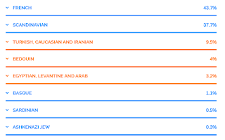
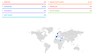
That said, there are elements of the ethnicity report that can be more reliable. On a continental level (European vs Sub-Saharan vs East Asian vs Native American, etc), the percentages are generally much more reliable, so if you're of mixed race, the report might be enlightening. But the more specific the regional or sub-continental the percentage breakdown is, the more speculative it becomes, with only some exceptions in populations with high levels of endogamy (like Ashkenazi Jewish, or certain islander populations). So while it may be tempting to go with the company that offers the most percentage breakdown into specific nations, keep in mind that this will likely make it less reliable. 

Ethnicity percentages are fun to explore, but you can't take them very literally. It's better to view them on a broader scale, covering bigger areas, but of course that's not what most people want. 23andMe's percentages have categories like "Broadly Northwest European" which covers a large area, and therefore is more reliable, but then people complain it's not specific enough.

You may notice I keep specifying ethnicity percentages, or percentage breakdown. That's because some companies offer sub-regional reports that don't include percentages because they are calculated a different way. At AncestryDNA, they are called Genetic Communities, and unlike the percentages, positive results in Genetic Communities tend to be very specific to small areas, and highly accurate. Not getting results in a GC doesn't mean you don't have ancestry there though, you generally need significant ancestry from a specific area to get results in a GC. When you do get GC results, you can be 99% sure you have ancestry from that area, you just won't know how much because there's no percentage. 23andMe have similar sub-regional results with no percentages, but in my experience, they are not as reliable as AncestryDNA's Genetic Communities. 

Conclusion

In short, here's my recommendations:

        For genealogy - AncestryDNA

        For foreign matches - MyHeritage (or test at AncestryDNA and upload to MyHeritage for the best value).

        For health reports - 23andMe

        For unknown biological family - AncestryDNA, plus uploading to other companies, and if budget allows, also testing at 23andMe.

        For ethnicity - if this is your only reason for testing, please reconsider. If you really insist, then I'd recommend either AncestryDNA or 23andMe, for the same reasons I've detailed above: you can upload raw DNA data from AncestryDNA and 23andMe to MyHeritage and FamilyTreeDNA (for additional ethnicity results), but not vice versa. If your interests lean more towards health, go with 23andMe. If you think you may develop an interest in genealogy or family history at any point in the future, go with AncestryDNA.

Wednesday, September 16, 2020

Why All the Scotland?

Since AncestryDNA's latest update introduced Scotland as it's own population, separate from Ireland, separate from England, lots of people are getting unexpectedly high results in Scotland. Even people with no known Scottish ancestry are getting significant percentages in that category. And of course, everyone is asking "why?"

For once, Ancestry actually honestly addressed this by explaining that natives to the British Isles have a lot of genetic overlap and can be difficult to tell apart, highlighting the fact that this is still just an estimate or interpretation of our DNA, and it should not be taken too literally.

But Scotland also has a lot of genetic overlap with mainland Europe, and I wanted to share some data and visuals that help illustrate all this. Firstly, although they haven't added the link for it yet, if you pull up the "full history" of the Scotland category (add "/ethnicity/Scotland/history" to the URL after the long that ID number), you'll see it lists all the surrounding areas included in "Scotland" (screenshot above):

Primarily located in: Scotland, Northern Ireland
Also found in: Belgium, Channel Islands, England, Faroe Islands, France, Iceland, Ireland, Isle of Man, Luxembourg, Wales


That's a big area this category is covering and makes the title of solely "Scotland" seem a little misleading. So is the map, which, apart from Brittany, half of Northern Ireland, and a sliver of Northern England, isn't covering any of the other locations listed here. Brittany, the seemingly rogue area in France that is included in the Scotland map, might seem out of place, but it actually makes a lot of sense. Brittany, as the name suggests, is actually heavily Celtic. In the 5th century, Celtic Britons fled the Anglo-Saxon invasion of Britain and went to what is now Brittany, France. In fact, people there still speak a Celtic language called Breton that bares a similarity to Scottish Gaelic. But Scotland and France were often allies throughout history (united by their shared enemy, the English), so it wouldn't be unusual to see genetic similarities to other parts of France too.

And there's more.

I reference the PCA chart in the ethnicity white paper a lot, and there's a reason for that. It shows us upfront just how much genetic overlap there is among different regions. The latest PCA chart (shown right) is the most detailed yet, including a break down of countries that are lumped into bigger regions in our results.

It can be a little difficult to tell some of the icons apart, so I actually overlaid some colored blobs to show the overlapping regions. Even that can be difficult to tell apart because the overlap is so significant for the British Isles alone. This is why the rest of the British Isles is included in the "also found in" details.


The light blue blob is Ireland, dark blue is Scotland, red is Wales, and dark grey is England. Scotland, Wales, and England in particular are almost indistinguishable, and Ireland still have significant overlap with them. So it's hardly surprising if your break down of the British Isles isn't exactly what you'd expect.

And Scotland has some noteworthy overlap with a lot of mainland Europe too, not all of which are included in the "also found in" details. According to the PCA chart, European countries that have overlap with Scotland include Germany, France, Denmark, Netherlands, Norway, and even Sweden.

It's difficult to even see which countries are included because there's so much overlap.

So basically, if you have ancestry from any of these regions, including the ones in the "also found in" details or the ones in the PCA chart, it could theoretically be turning up in your Scotland results. So the final inclusive list should be more like:

Northern Ireland
England
Wales
Ireland
Netherlands
Denmark
Norway
Germany
Luxembourg
France
Belgium
Channel Islands
Faroe Islands
Iceland
Isle of Man
Sweden

That's all of the British Isles, and the majority of Scandinavia and Northwest Europe.

Granted, AncestryDNA's algorithm may have been able to weed out the likelihood of some of those areas showing up under Scotland (I know they remove PCA outliers), and perhaps that's why not all of these areas are listed in the full details, but that's not necessarily foolproof, so I would still keep in mind that all of these places have some genetic overlap with Scottish samples. 

The PCA chart is very enlightening and anytime you have a question about DNA ethnicity and unexpected results, this chart might be able to answer it. AncestryDNA aren't always very forthcoming about the fact that Europe is so genetically mixed and neighboring regions often share too much DNA to accurately tell them apart, but the PCA chart doesn't lie (though you can generally exclude extreme outliers). I just wish they'd release ones for other parts of the world too, and some for areas where continents mix. For example, I'd love to be able to see how much genetic overlap Southern Italy might have with the Middle East and Northern Africa. I'd also like to see what populations Ashkenazi Jews most closely match (at one point, they were on the European PCA chart, but due to the fact that they were so dissimilar to any other group in Europe, they were obviously removed - I'd love to see if perhaps they are more closely related to Middle Eastern samples than European ones). And of course, not everyone is white and it'd be great if AncestryDNA provided as much background data about other parts of the world as they do with Europe. Providing PCA charts for them would be a great start.

Additionally, AncestryDNA used to have a chart that showed the average admixture for their samples (for people native to each region). For example, it showed us that the average person from the region which was "Italy/Greece" could expect to get about 10% results in the Middle East or Caucasus. It was highly informative in illustrating how genetically mixed some areas are (and also how distinct other populations can be). I have begged AncestryDNA support multiple times to make this data available again, but they refuse. I think they don't want to "confuse" customers too much, but in my experience, the less information you give people, the more confused they'll be. The constant questions about this I see on social platforms prove it.

Friday, September 11, 2020

AncestryDNA 2020 Ethnicity Update is Here!

Well, that was quick. Only days after announcing the update would happen in the next coming weeks, I have received the update already. It may still be rolling out for some people, but I imagine you'll get it in the next few days.

My update in comparison to the last one really highlights once again how much genetic overlap there is among the British Isles, Germanic Europe, and Scandinavia. I have ancestry from all three places, and AncestryDNA (and other companies) can never get them right. With each update, it swings from one extreme to another. The last update, for example, had me at 0% Norway even though I had one Norwegian great grandfather. With the latest update, I'm now 15% Norwegian! This is pretty close to the 12.5% the paper trails says I should be, but of course, we do not necessarily inherit exactly 12.5% from each great grandparent, so 15% is totally plausible, apart from the fact that all other reports usually underestimate my Norwegian ancestry (usually under 10%) which has also lead me to suspect that I inherited less than 12.5% from that particular ancestor. I don't know that though, it's just a hunch, so I can't say 15% is "wrong".

Anyway, here's the full breakdown, in comparison to what it was before.

2019 Estimate:
43% Germanic Europe
22% England, Wales & Northwestern Europe
21% France
12% Italy
2% Greece & the Balkans

2020 Estimate:
27% Germanic Europe
18% Scotland
15% Norway
12% England & Northwestern Europe
12% Southern Italy
11% Northern Italy
5% France

My Italian results have been bumped back up to a reasonable amount (if you recall, I had one Italian grandmother), but they are still lower than what I know they should be. As I've talked about before, my paternal grandfather tested so I know I inherited 18% from him, which means I inherited 32% from my paternal Italian grandmother. So I am fortunately enough to know for a fact that I should 32% Italian. The new results breaking down North and South Italy add up to only 23% (though if that 5% France is coming from my Italian ancestry, then it's 28%). Had my grandfather not tested, I would assume 23% is close enough to the expected 25% and been happy with that, but because I know differently, it's a little disappointing. Additionally, my Italian ancestry is supposed to be entirely southern, not northern, but I'm not hugely surprised they weren't able to tell the difference.

Back to Northern Europe. According to my tree, I should be about 23% Germanic, 32% British (English and Scots-Irish), and as mentioned, 12.5% Norwegian. But I am German and British on both sides of my tree, so really, who knows how much I inherited of each? Especially with the new breakdown of the British Isles into four groups - England, Wales, Scotland, and Ireland - I really haven't even tried to determine how much of my English vs Scots-Irish I might have inherited according to my tree. I do have more recent English ancestry (an English ancestor who immigrated in the 1850s, whereas all Scottish or Scots-Irish immigrated in colonial times), so all I can say for sure is that I can reasonably expect my English results to be higher than Scottish, which they are not. However, combined, they do add up to 30%, which is very close to my estimate according to my tree, and I correctly don't have any results in Wales or Ireland. Of course, this leaves me with 27% Germanic, which is again pretty close to my estimate based on my tree.

So, overall, this new DNA estimate is pretty accurate, if we look at it from a broader view by lumping North and South Italy back together, and England and Scotland back together. If they hadn't tried to split those regions up and just changed my percentages, it would really be spot on.

I can't say the same for my dad's report (right).

The last update in 2019 had my dad at exactly 50% Italian, which was exactly right. My dad's mother was Italian and since we do get exactly 50% from each parent, his ethnicity report should reflect that. A few percentage difference may be within a margin of error, but to get exactly 50% gave me a lot of confidence in the results, so to move away from that 50% even slightly feels like a major downgrade.

Dad's 2019 Estimate:
50% Italy
31% England, Wales & Northwestern Europe
7% Ireland & Scotland
7% France
5% Germanic Europe

Dad's 2020 Estimate:
29% Southern Italy
19% England & Northwestern Europe
16% Scotland
15% Northern Italy
7% Turkey & the Caucasus
5% Norway
4% Germanic Europe
3% Greece & Albania
2% Ireland

According to my dad's tree, he should be 50% Italian, and the other half about 30% Germanic, 20% British (mostly Scottish or Scots-Irish), so to see so many more regions in his list than before instantly felt like a regression. His total Italian results are only 44%, and even if you try to add in neighboring regions like Greece and Turkey, he then has 54%. I know that's not far off 50%, but again, when his previous results were exactly 50%, it feels like a downgrade to deviate from that even slightly.

His Germanic results didn't change much at all, which means it's still being massively under reported, but when you consider that it's probably showing up under the "Northwestern Europe" part of England, it's actually pretty accurate. Combining Northwest Europe and Germanic, he gets 22%, which isn't too far off what his tree estimates. And who knows where that 5% Norway is coming from - could be either his Germanic or British ancestry. That leaves the 16% Scotland and 2% Ireland, which is very close to what his tree is for Scottish and Scots-Irish.

So again, combining specific regions does add up to make some sense, but there's also some regressions.

Over analyzing all my kits might be getting a little tedious, so I'll summarize the rest. My mom's kit (right) went from a very accurate 27% Norwegian (remember, she had one Norwegian grandparent), to a greatly overestimated 46%. She also got 11% in Wales and 10% in Sweden, neither being places she has ancestry in (and that Swedish results can't be coming from her Norwegian ancestry since that would bump it up to 56%, more than double what should be expected).

My paternal grandfather's results at AncestryDNA have always overestimated his British ancestry and underestimated his German ancestry. He should be about 40% British (Scottish or Scots-Irish), and 60% Germanic, but the results are always flipped, and this time is no different, with only 33% Germanic. Granted, he has 38% in England & Northwest Europe, which could go either way. Then he has 27% in Scotland. So what it's really saying is 38% of his DNA can't be distinguished between British and Germanic, which isn't surprising.

Finally, my husband's results (right). My husband is actually a British native - his father was Irish and his mother was mostly English with one Scottish branch and one Irish branch from further back, so he would be roughly 53% Irish, 41% English, and 6% Scottish. His previous results reflected that almost exactly with 43% England, and 56% Ireland/Scotland. So just like with my dad's Italian results, any deviation from that seems like a regression, and that's what happened here too. His new results have him at 41% Ireland, 33% England, and 25% Scotland. For someone who is pretty close to half English and half Irish, this is way off, but that's hardly surprising, since the PCA chart shows there's really not much distinction among these small, neighboring regions so I don't know why they are even attempting to split them up. At least his Genetic Communities are very accurate.

Additionally, the last 2 updates gave my husband 1% noise results in Africa, and for some reason it still remains. I know he's not the only one though, I have seen other reports of people with predominately British ancestry getting 1% in Africa with no known history of it. It's likely just noise, but I wish they'd sort it out already.

So, while I'm pleased that my Italian and Norwegian results accurately went up, the rest of the changes are a bit of a disappointment.